Thermo
An APP that collects personal data to optimize offices' temperature.
Type
Mobile App resulted from a class named Personal Informatics
Time
2018.1-2018.4 & 2018.12 & 2020.3
Teammates
Bess Anderson (UX Designer / UX Researcher) / David Goldin (UX Researcher) / Wenyang Mu (UX Designer)
My Role
Product Designer / Information Architect
Skills
Interaction Design / Product Thinking / Diagramming / Behavioral-Change Framework / Participatory Research
Tools
Illustrator / Sketch / Principle
PROBLEM & GOAL
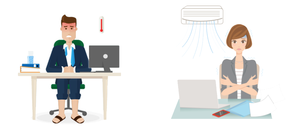
In an office, he feels hot, while she feels cold! Energy is wasted...
The goal of this system is to:
Make everyone feel good about room temperature.
Support energy-savings.
RESEARCH
To engage the interviewers more, thus gather deeper insights and build better empathy, we followed the methodology of participatory design, which resulted in artifacts with insightful user journey as below:
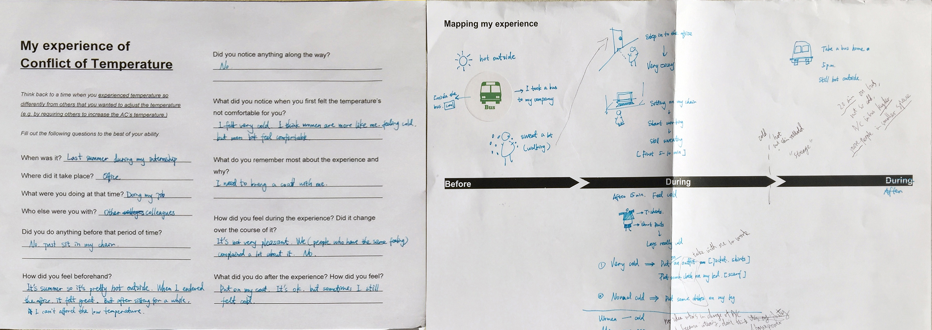
From the interviews, we got the following insights:
-
INSIGHT 1. Temperature comfort depends on:
Temperature.
Gender.
Outfit.
Activity (duration of less than 20 min).
Natural Light.
-
INSIGHT 2. In a public space, people seldom change the temperature:
Rarely know how to control over the AC System.
Hesitate to make any changes that may affect others.
Have to bring extra clothings.
USER FLOW & INFORMATION FLOW
1. Storyboard for the User Flow
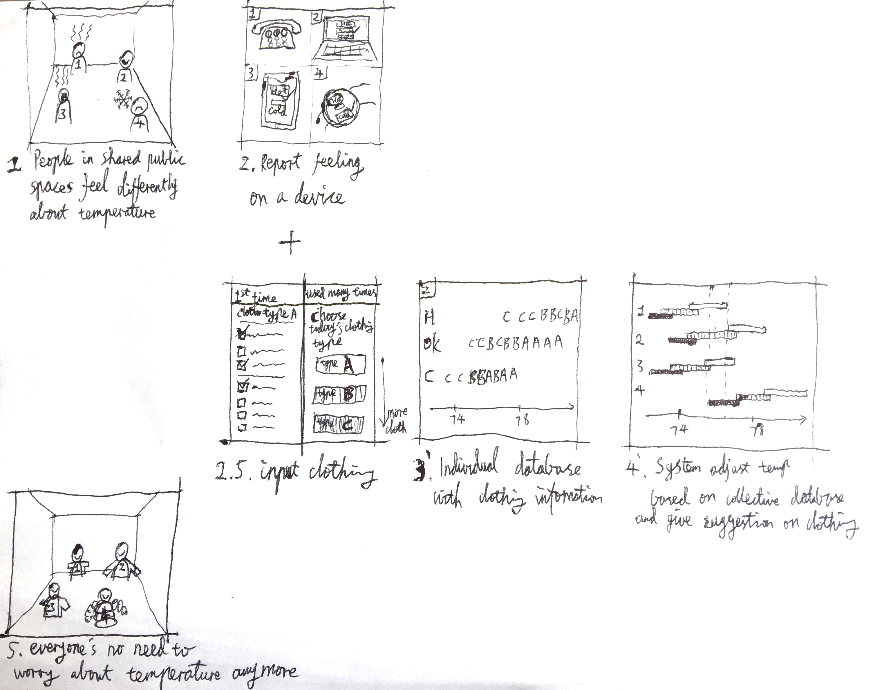
Users report cold/hot and what they wear -> The system gets their ranges -> The system calculates the range that fits all users.
2. Diagram the Information Flow
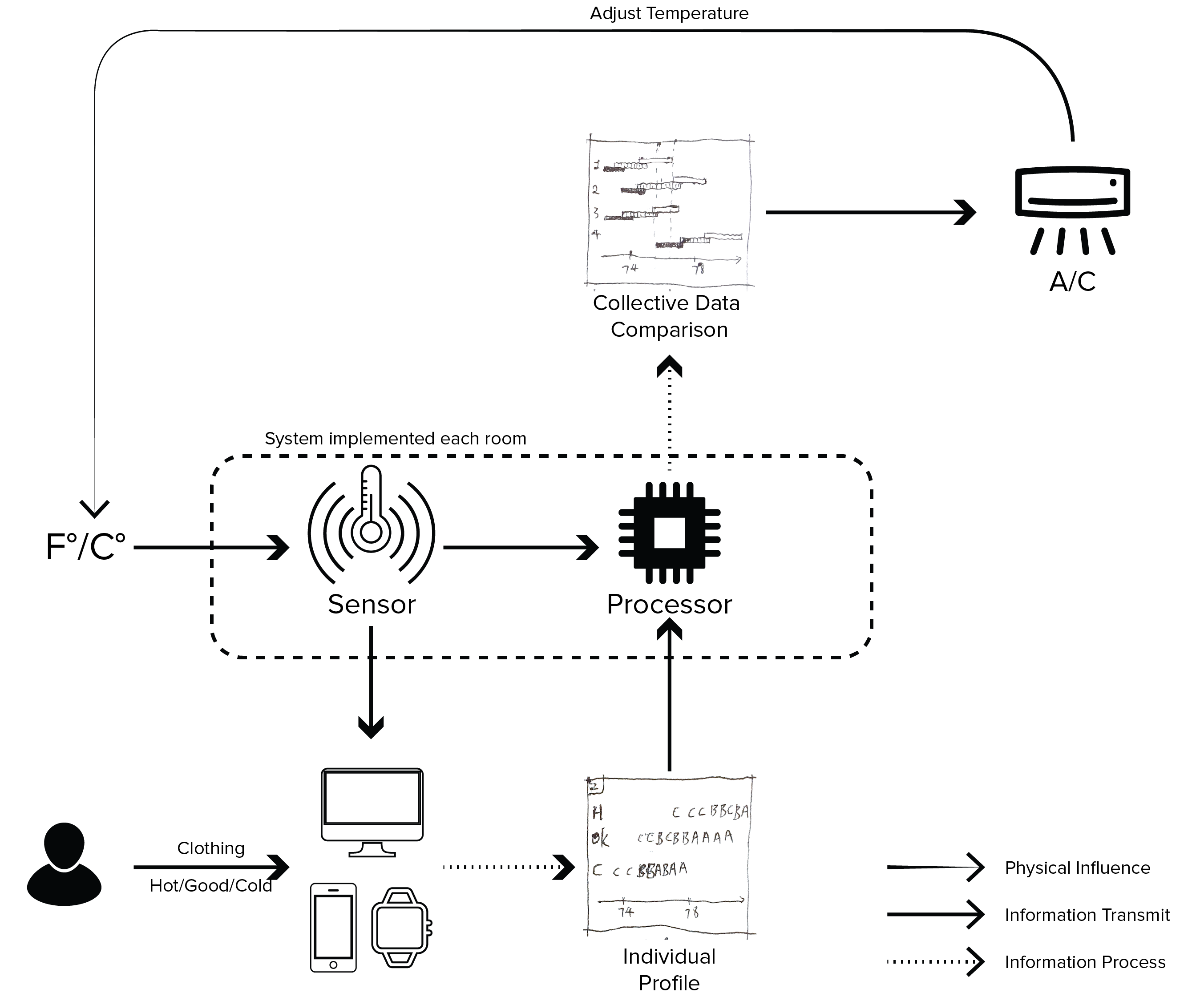
Based on the storyboard, "what components are needed and how do they convey the information inside or outside of the system?" became a critical question to process.
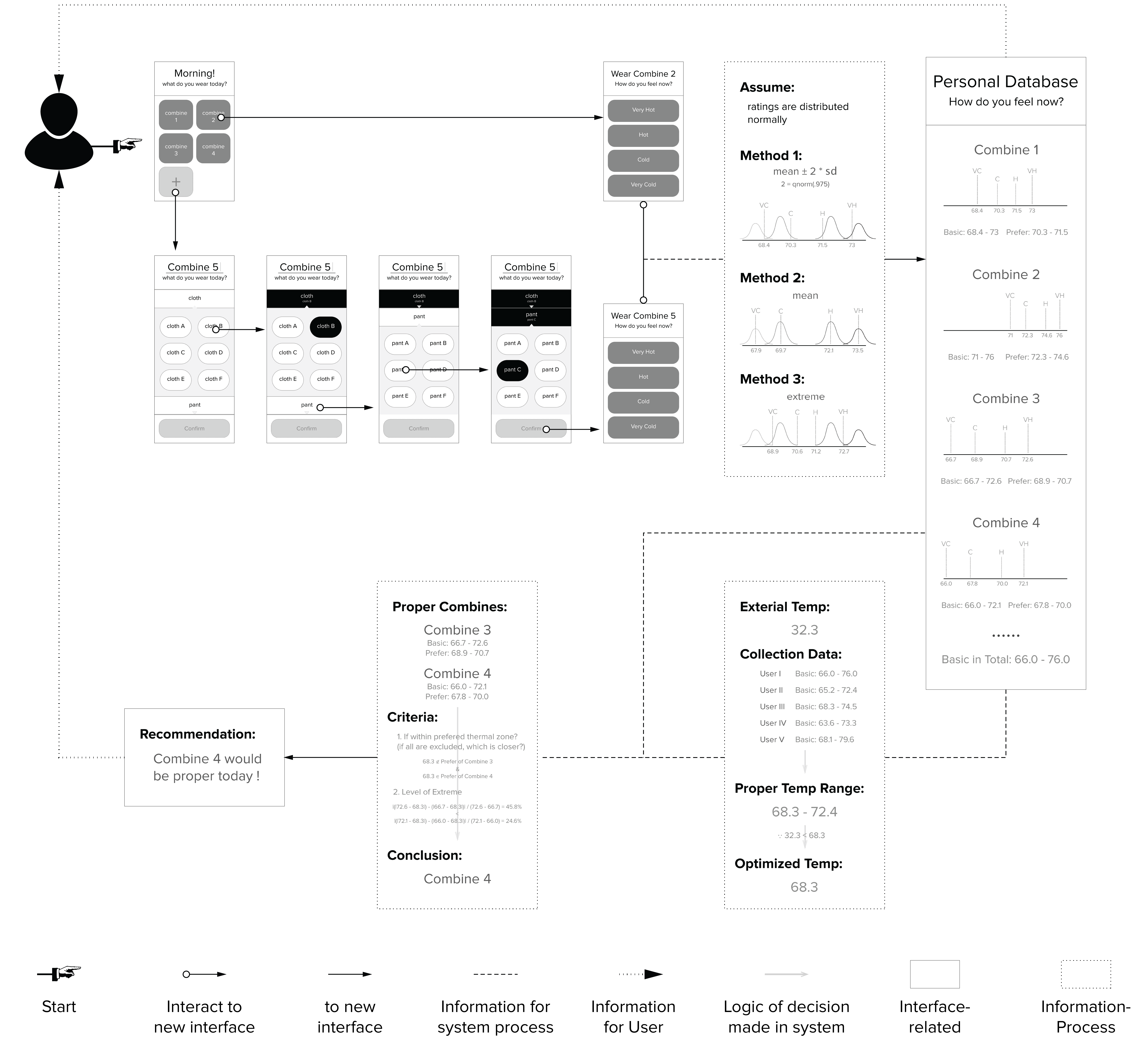
3. Wireframe for front-end and Algorithm for back-end
In order to assist users and make users trust the system, adaptability, accuracy and eco-friendliness (save energy) would be the keys. To ensure they are addressed, the diagram was produced to answer questions:
What if no enough outfits are listed?
What if users' reports/ratings are not stable?
Within the temperature range, what degree will be targeted?
DESIGN DETAILS
I approach design by proposing design questions at different points along the user flow. In this case, I'll give three examples and how I iterated the designs.
Design question 1: how to help users plan for outfits?
Version 1: In Option A, users selected an outfit and saw a list of the detailed feeling forecast in different offices based on the user’s schedule. Option B could provide more immediate feedback on the choice in a simple dynamic chart but with fewer details.
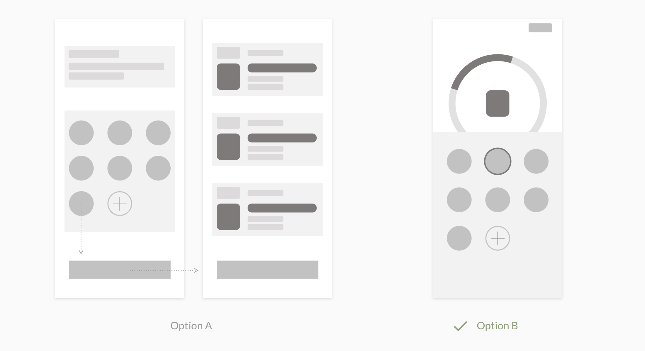
In the early usability test, most users preferred option B for its intuitiveness and simplicity.
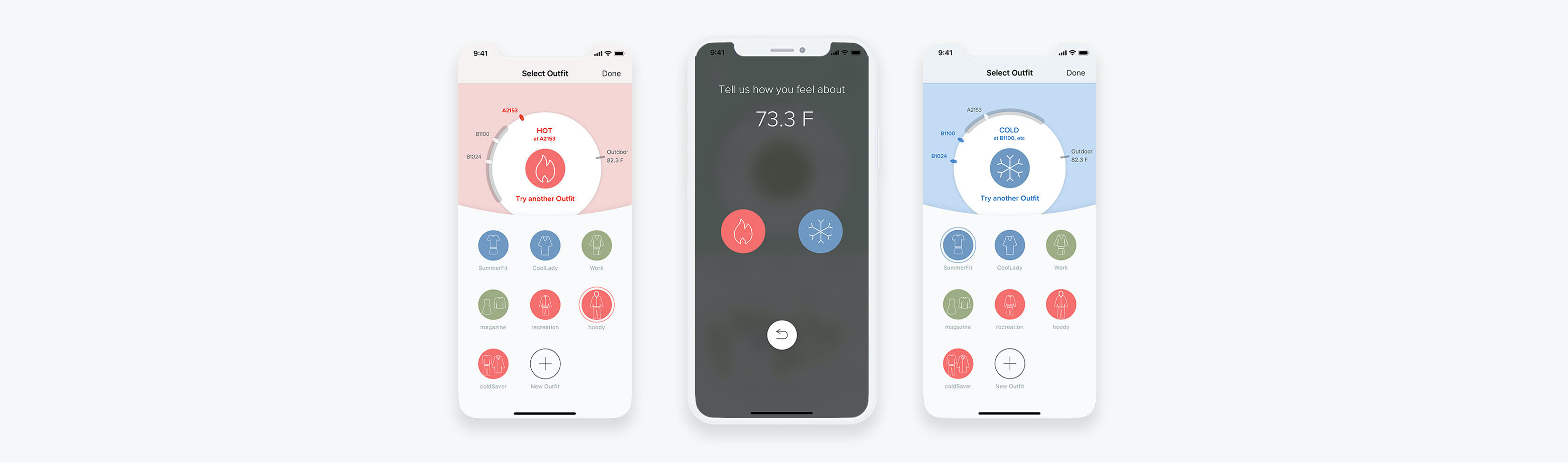
Version 2: Users got quick feedback on their outfit choice, and colors of the background change accordingly. Colors of the outfit choices implied their warmth tendency.
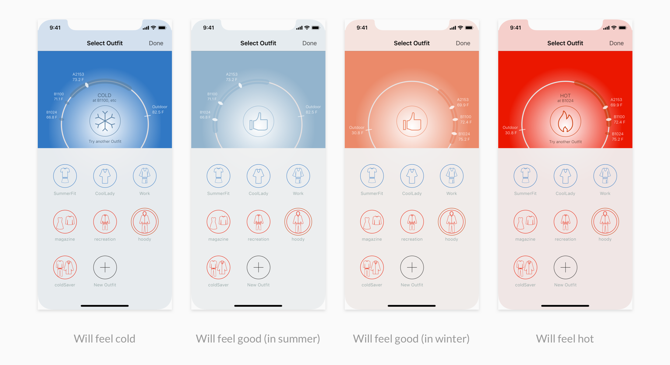
In the usability test, users found the color system confusing (e.g. tapped a red outfit and the prediction turns blue) and complicated (they could not identify why there were two "good" colors). In addition, the legibility was weak.
Version 3: The color system was simplified to 3 types. The colors of the outfit choices also aligned with the prediction. Legibility was increased by the help of WebAIM’s Contrast Checker.
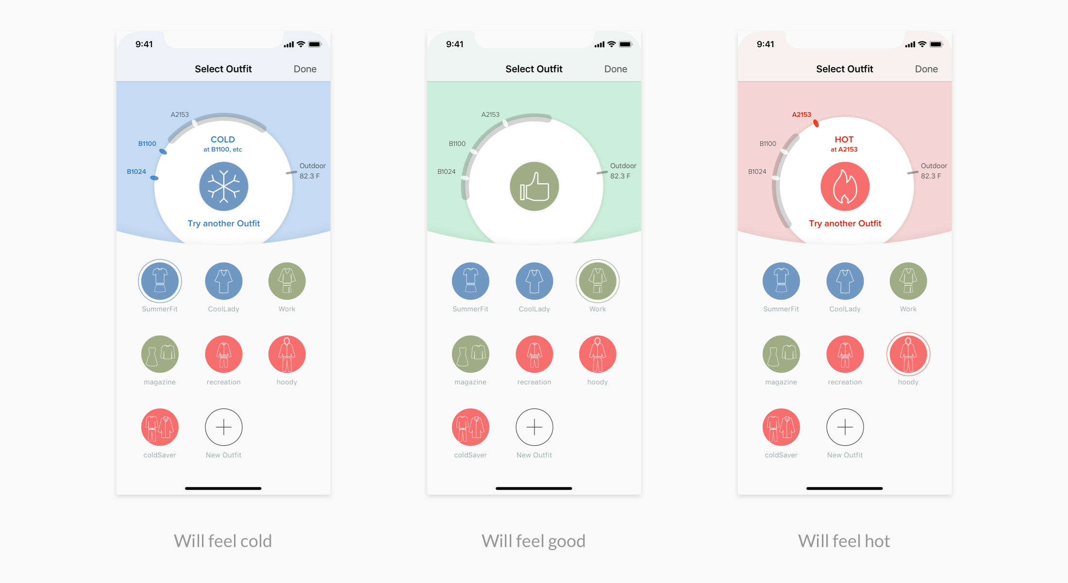
Users loved this version. In the test of 5 participants, the average time for this task reduced by 37% and no confusions were braugh up compared to 4 in the last round.
Design question 2: how does a user report his/her feeling?
Version 1: Option A provided a slider for users to select: "very hot", "hot", "ok", "cold", or "very cold". Option B simply provided 3 buttons for users: "hot", "ok", and "cold".
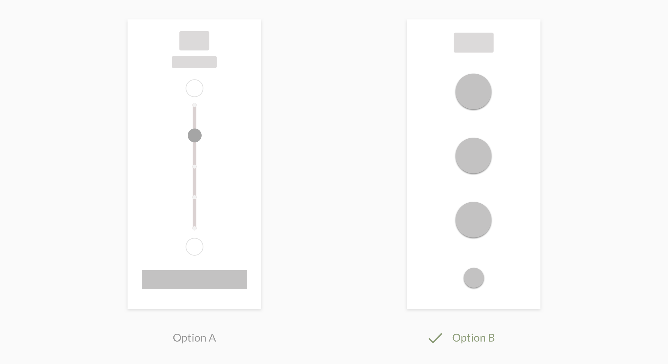
Most test participants preferred option B because it was easier to opporate and required less thinking (they didn't have to think if they felt hot or very hot).
Version 2:
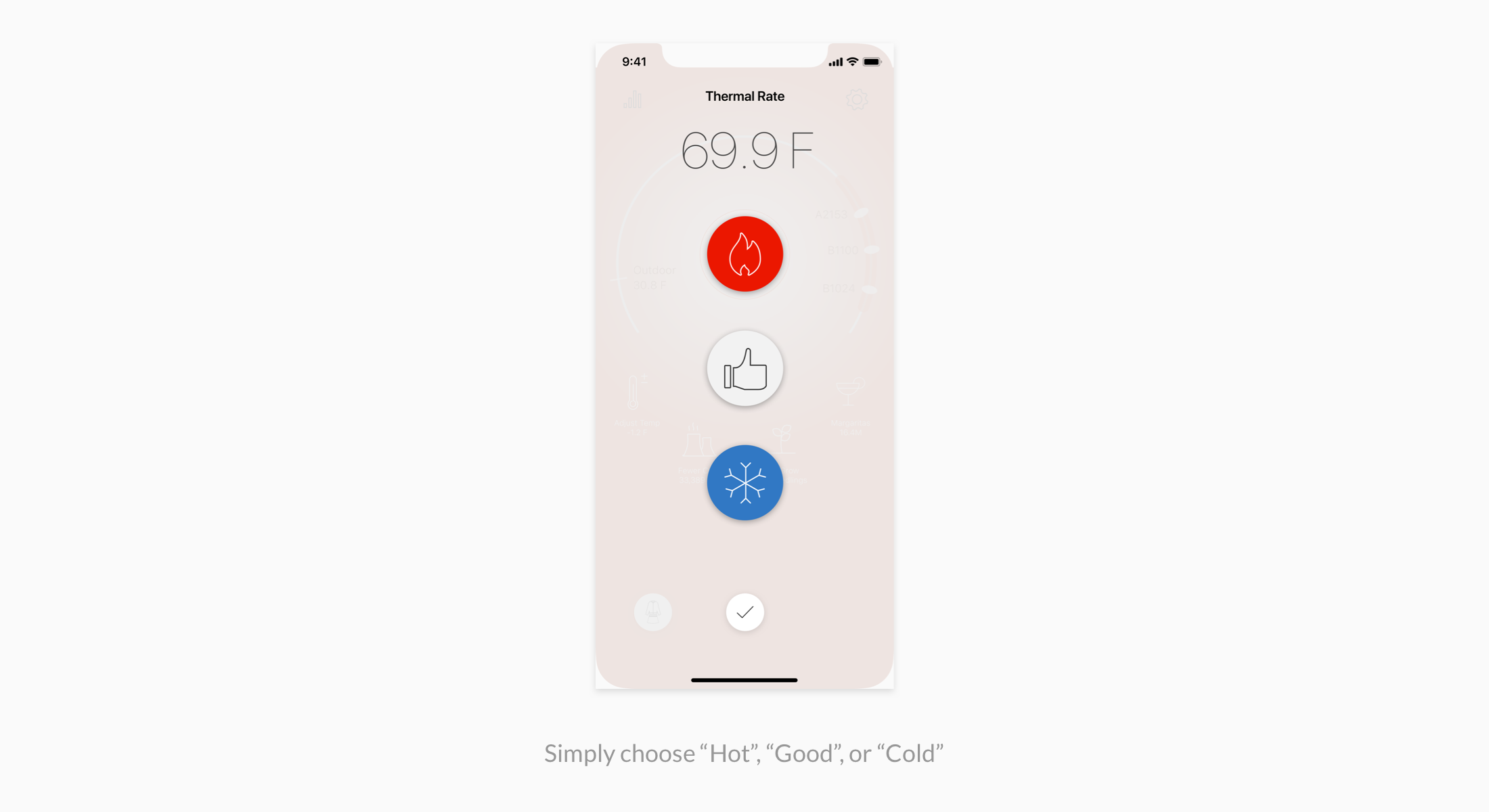
Some users found it confusing to see a current status in the option and found it redundant. In addition, the function of "✓" button, which was confirmation, was not intuitive to some users. Furthermore, the layout of the buttons made the efforts to choose "hot" or "cold" quite different from each other.
Version 3: The number of options were simplified to two status that differed the user's current status. Only after selection, "Back" button got changed to "✓". The efforts to choose each status became much similar to each other.
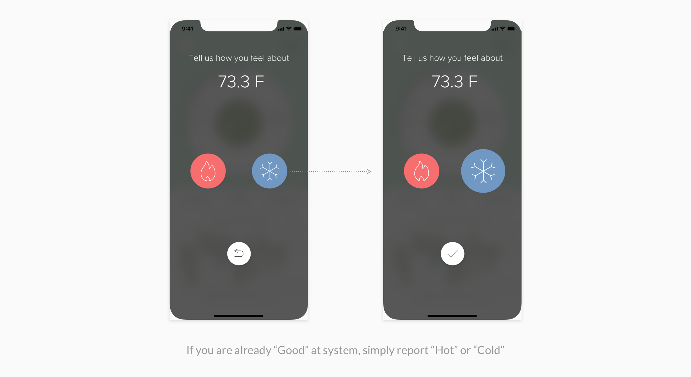
In the usability test of 5 participants, the average time for this task reduced by 12% and, again, no confusions or usability issues were braugh up compared to 3 in the earlier round.
Design question 3: How does ThermO motivate users and keep them engaged?
Version 1: Option A prioritized the visualization of users’ aggregated data while enabled users to check detailed data for "today". Option B provided two modes: Status Chart Mode for "today" with encouraging impact-related data, and History Mode documenting personal aggregated data.
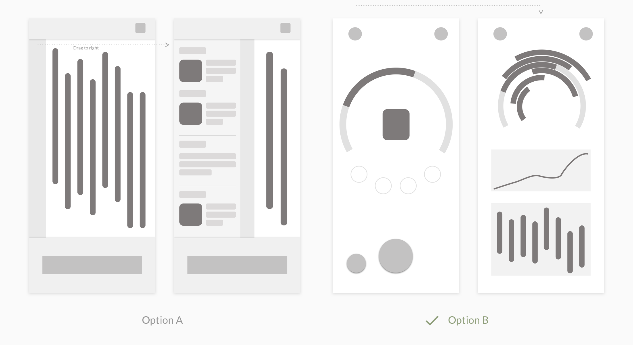
Most users preferred option B for its because it looked more dynamic and promised more interesting information.
Version 2:
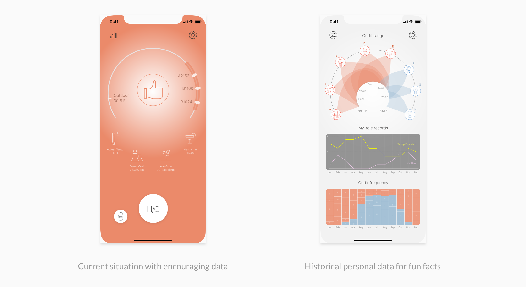
Although the data visualization caught users' eyes at the first glance, it turned out to be difficult for them to understand and gather useful or exciting insights. The impact-related data in Status Chart Mode also failed to be felt relevant an thus not encouraging enough.
Version 3: The two modes in Version 2 were integrated for users to quickly scanned. All data visualizations served the purposes of informing users of the decision-making process, their meaningful impacts of engaging, and situations of all people in the same office.
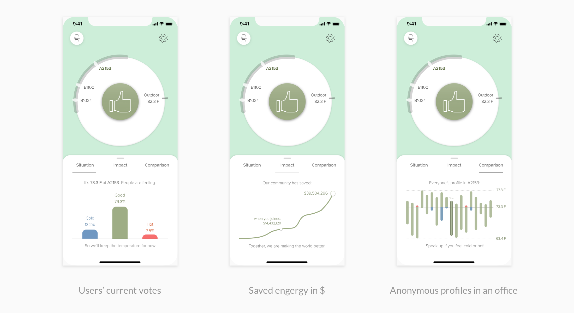
In the usability test, for the first 30 seconds, 4 out of 5 participants could understand the data visualization without any instructions, compared to 1 out of 5 in the eralier round.
STRATEGIES FOR ENGAGEMENT
During the design process, I have adopted a psychological pattern to help drive users' engagement and to motivate behavior change. The stratagy is "Direct the Rider, Motivate the Elephant, and Shape the Path". It means rationaly informing users of the value of using, emotionally attract users to enjoy using, and fostering a environment where many users are involved.
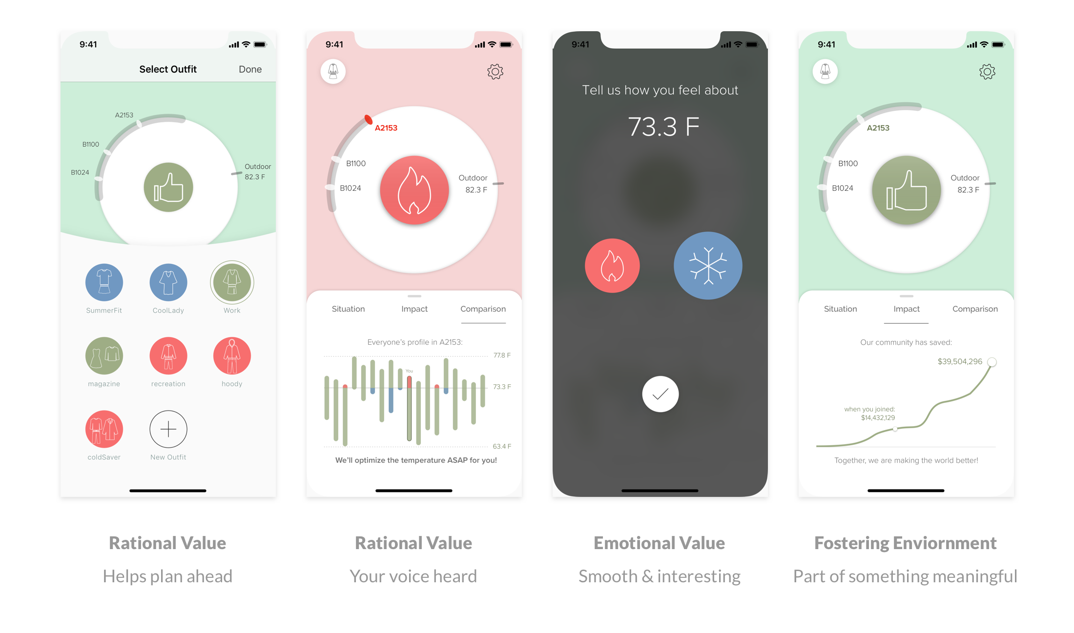
Based on the users' feedback, they did understand the rational values the app could bring, they felt happy to experience the interactions, and they could feel the excitement of being a part of this.
SOLUTION DEMO
REFLECTIONS
Next Steps
-
Design for Logistic functions like register for offices, linking to schedules and other settings.
-
Design for multi-platform, like wearable devices, etc.
Take-aways
-
Make use of diagrams. If something is too complicated to explain and discuss in words, then illustrate it in the form of diagrams as the common ground for collaboration.
-
Enjoy taking initiative and being bold. During the whole process, I often make "extra" efforts, including elaborating diagrams and figuring out the ways to develop it using Arduino, Framer, and Firebase. Although we did not have enough time to really fulfill that ambition, I have learned a lot through the way and, most importantly, have earned my teammates' trust and friendship.
-
Keep testing, learning and iterating. I iterated the project for two major rounds even after the class was finished, by collecting feedback and learning new skills, I have learned many and been proud to notice how much experience of this project has been improved.