Optimized for Desktop, mobile version coming soon :)
DA Up-to-date
Redesigned a Dealership Management System
and boosted the user experience and increased working efficiency by ~87.5%

Platform
Desktop (major),
mobile (consider for future)
Role
UX Design Consultant
(work with an in-house PM closely)
Duration
~ 4 mon (part-time)
context
What “DA” is: Dealership Advantage
Dealership Advantage is a dealership management web app designated to make a dealer's life easier by facilitating each step in the process of ordering, refitting, and selling boats.
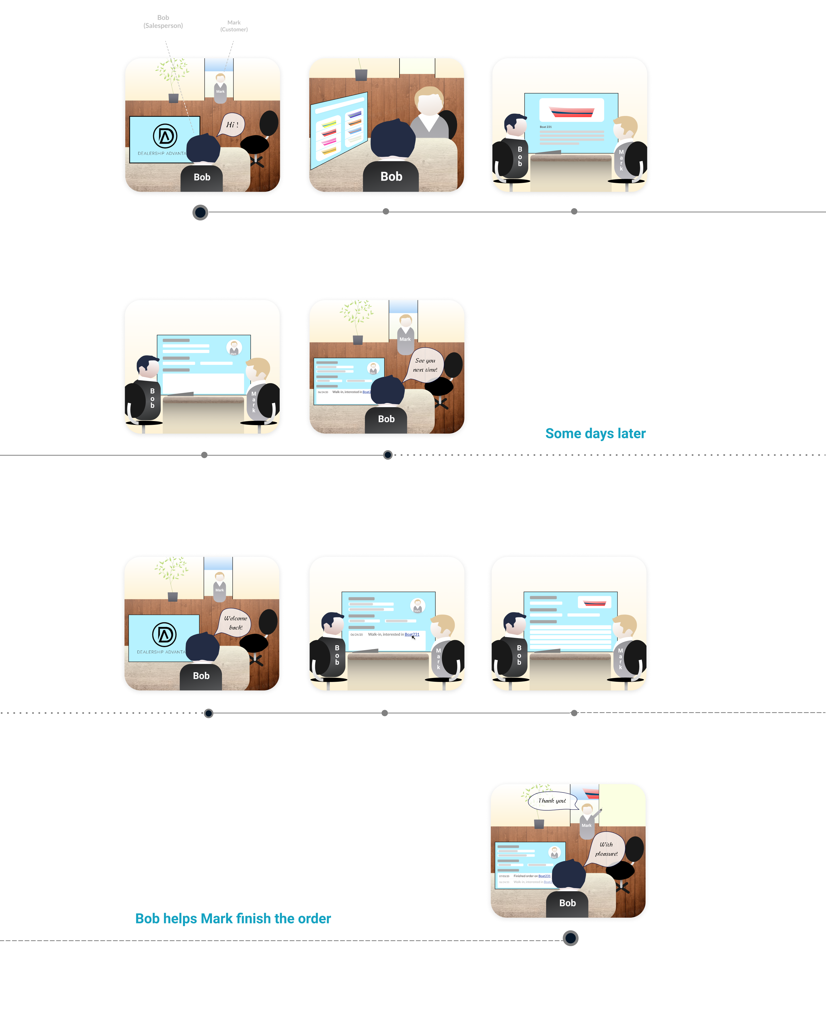
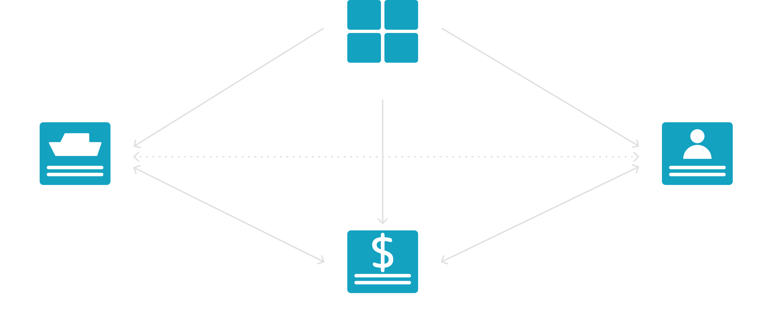
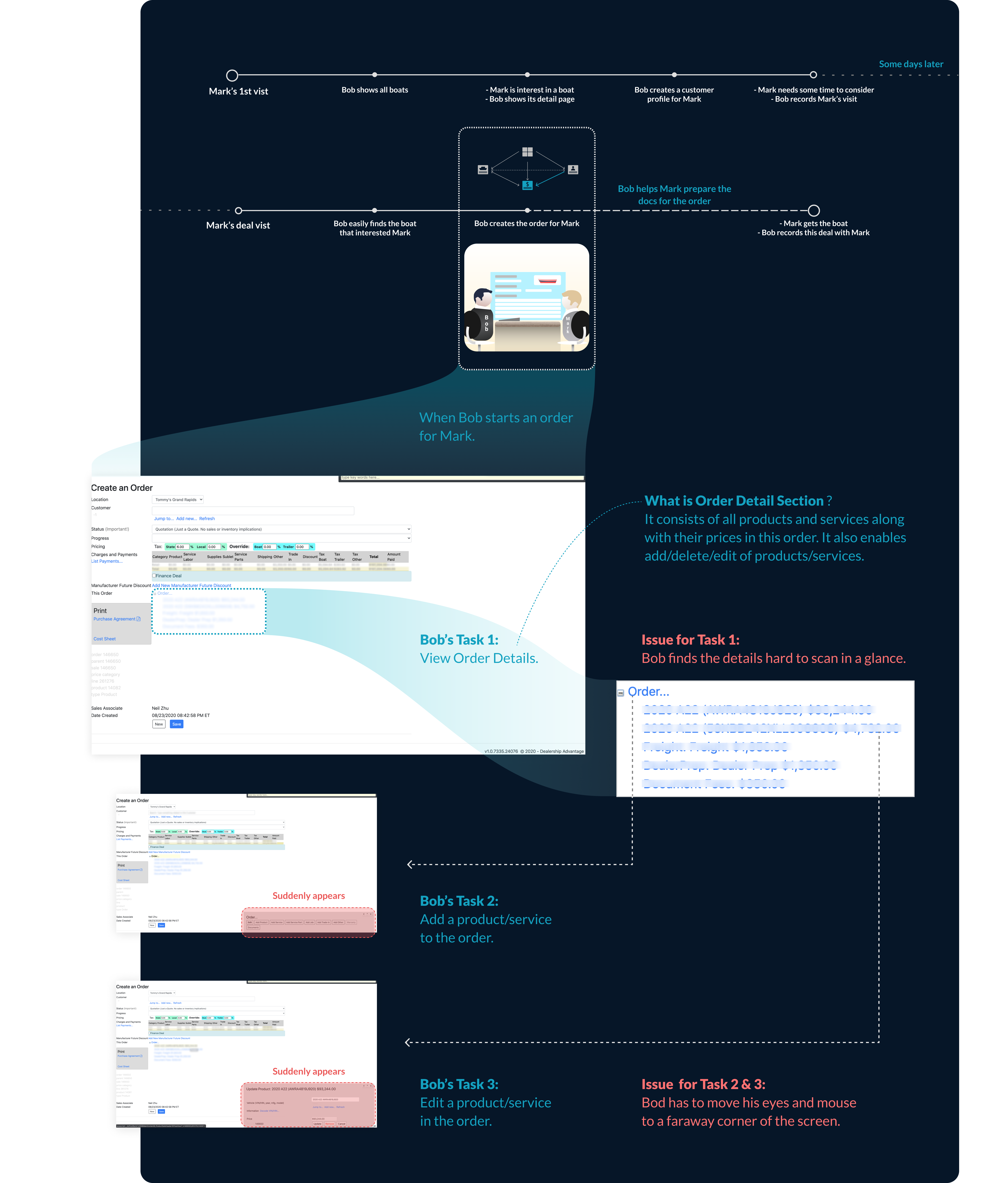
Typical Flow: a salesperson sells a boat
With the insights I gathered through the conversations/interviews with Sales staff, the typical interactions between a salesman and his customer emerged:
Sitemap of the Selling Flow
Problem: the legacy DA web app was outdated
The legacy web app was outdated in both system performance and user experience, which stuck the users’
working efficiency and the business’ scalability.
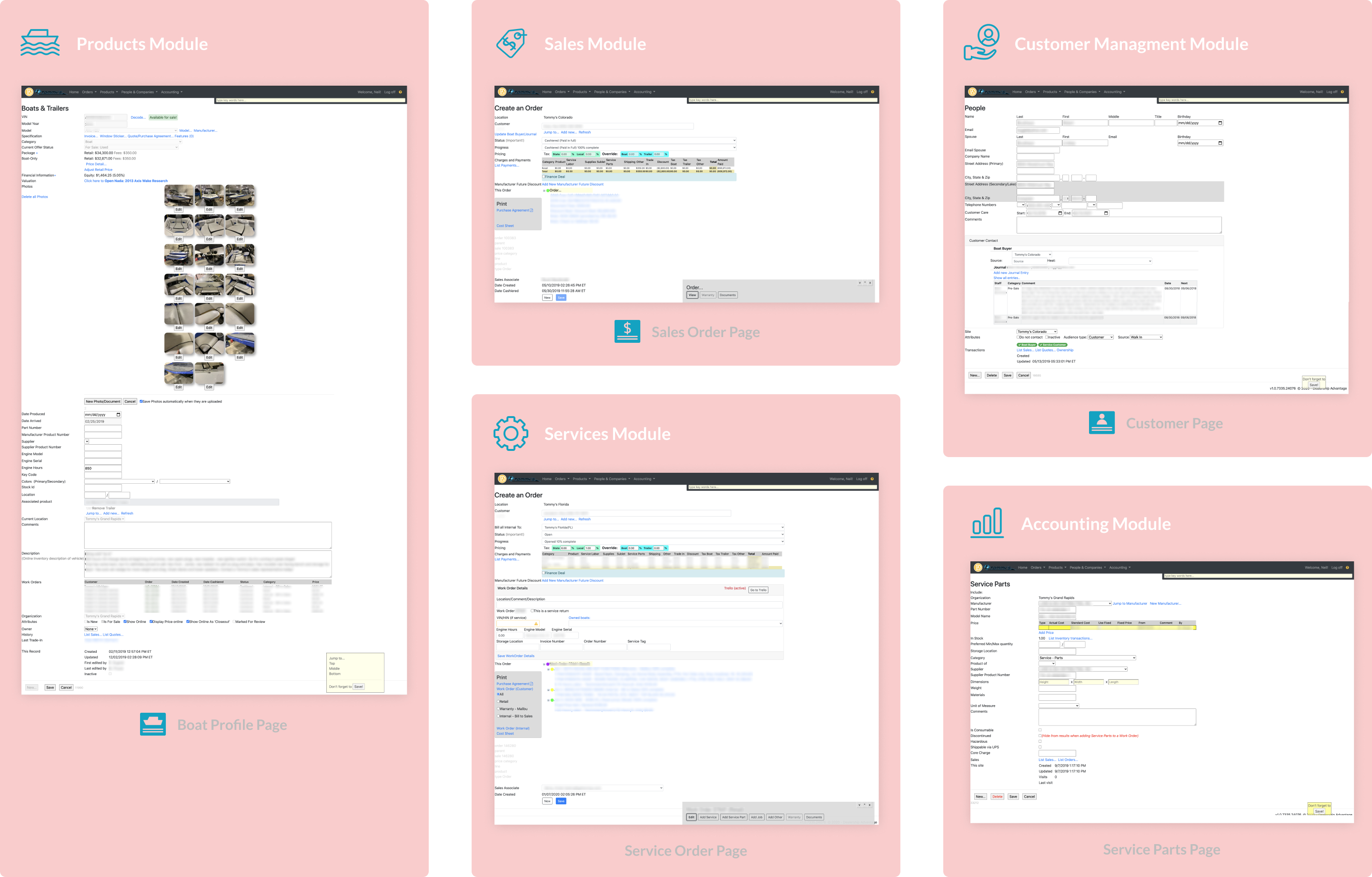
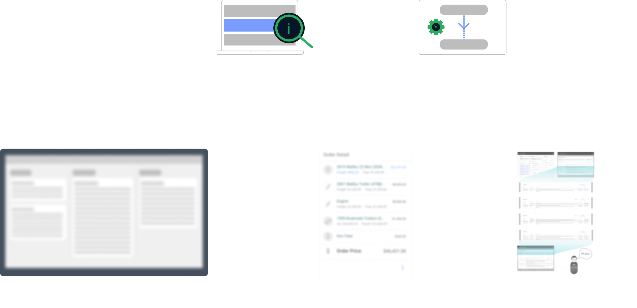
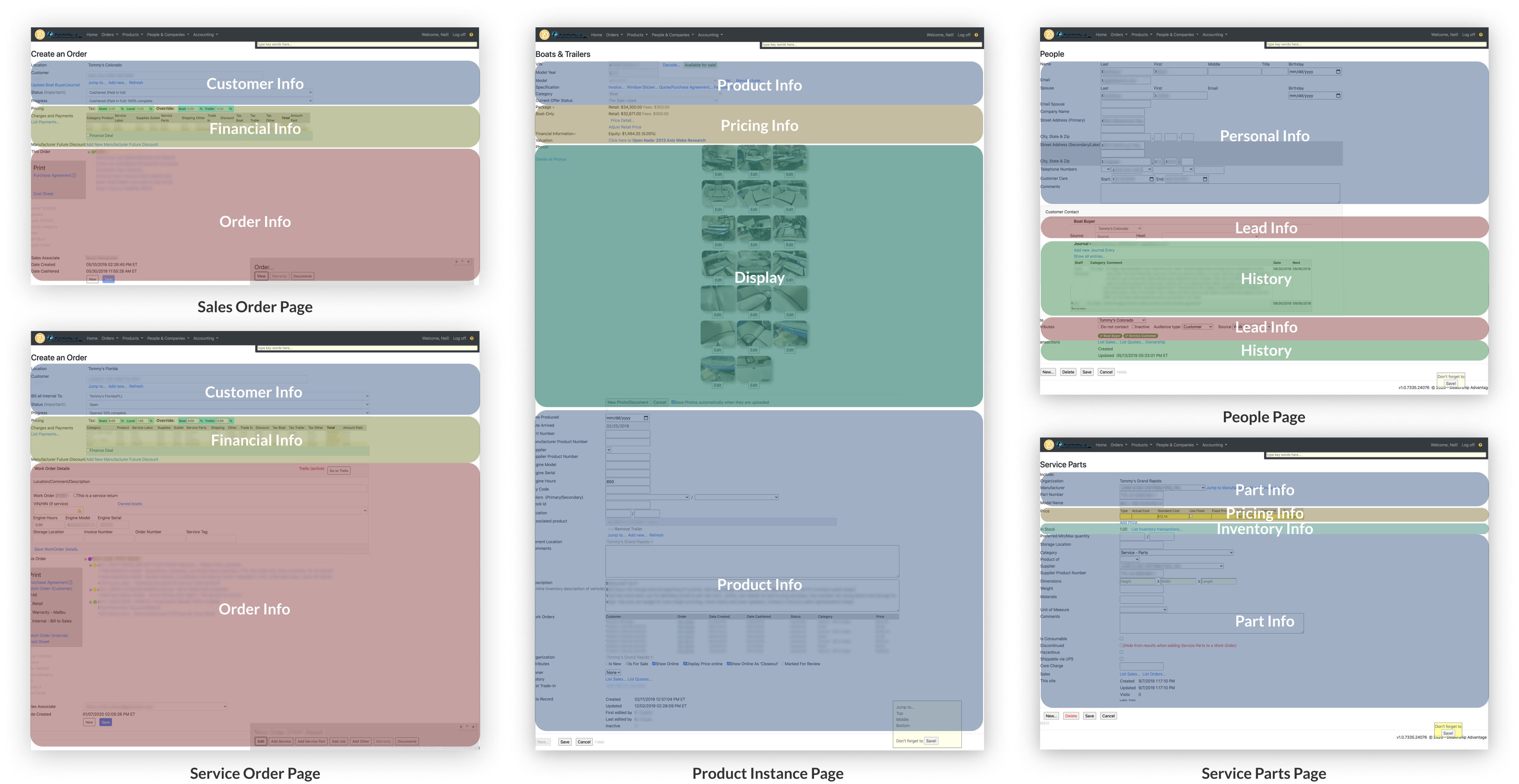
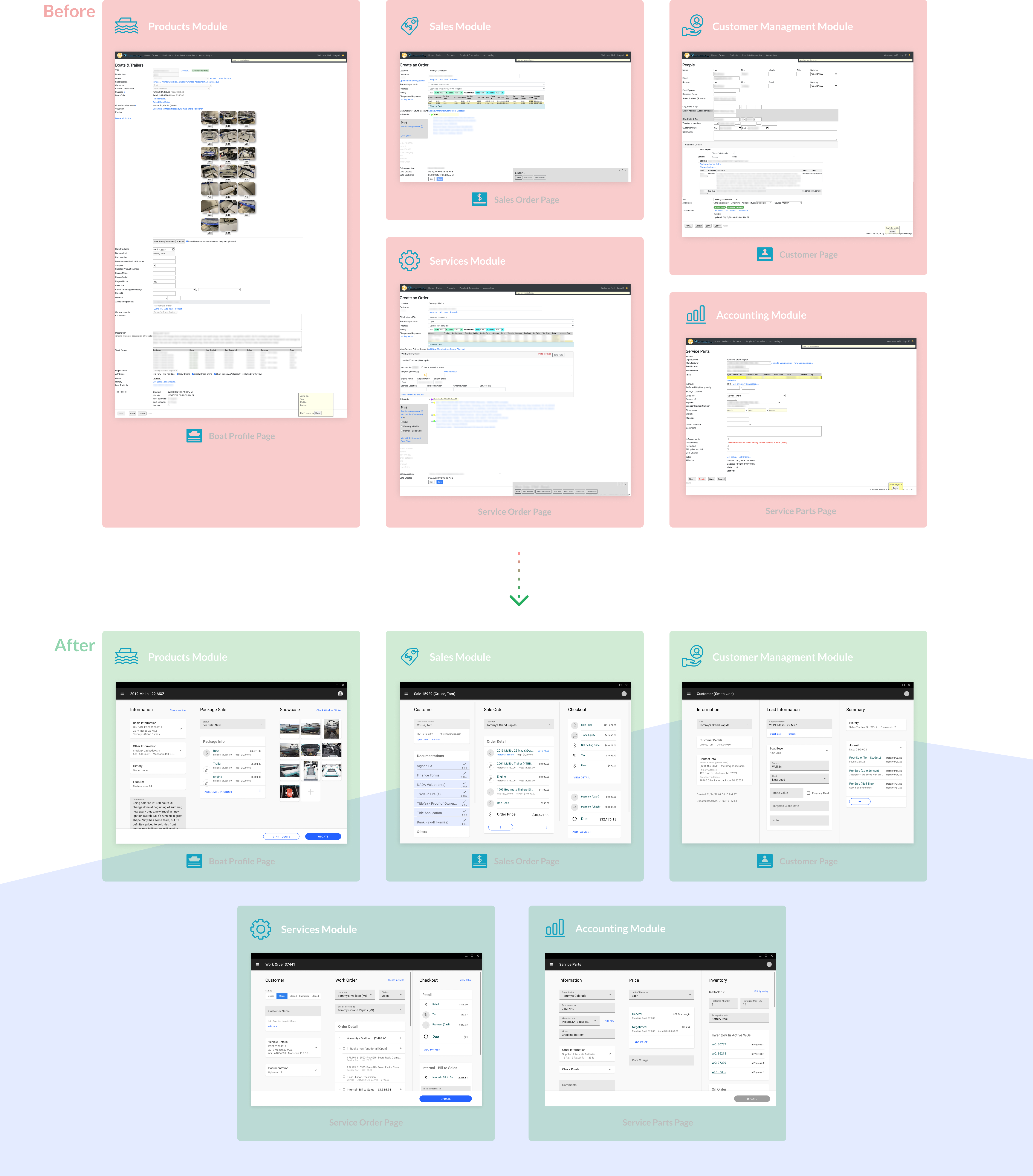
There are functionally 5 modules that I have worked on. Below are the typical pages (including the pages needed in the
aforementioned flow) of each:
After talking with stakeholders as well as the Sales Manager, and digging into the legacy pages, I have identified 2 major types of problems:
DA strived to modernize the web app
North-star Goals: organized & efficient
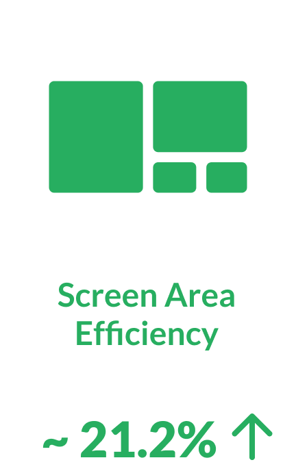
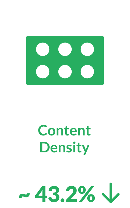
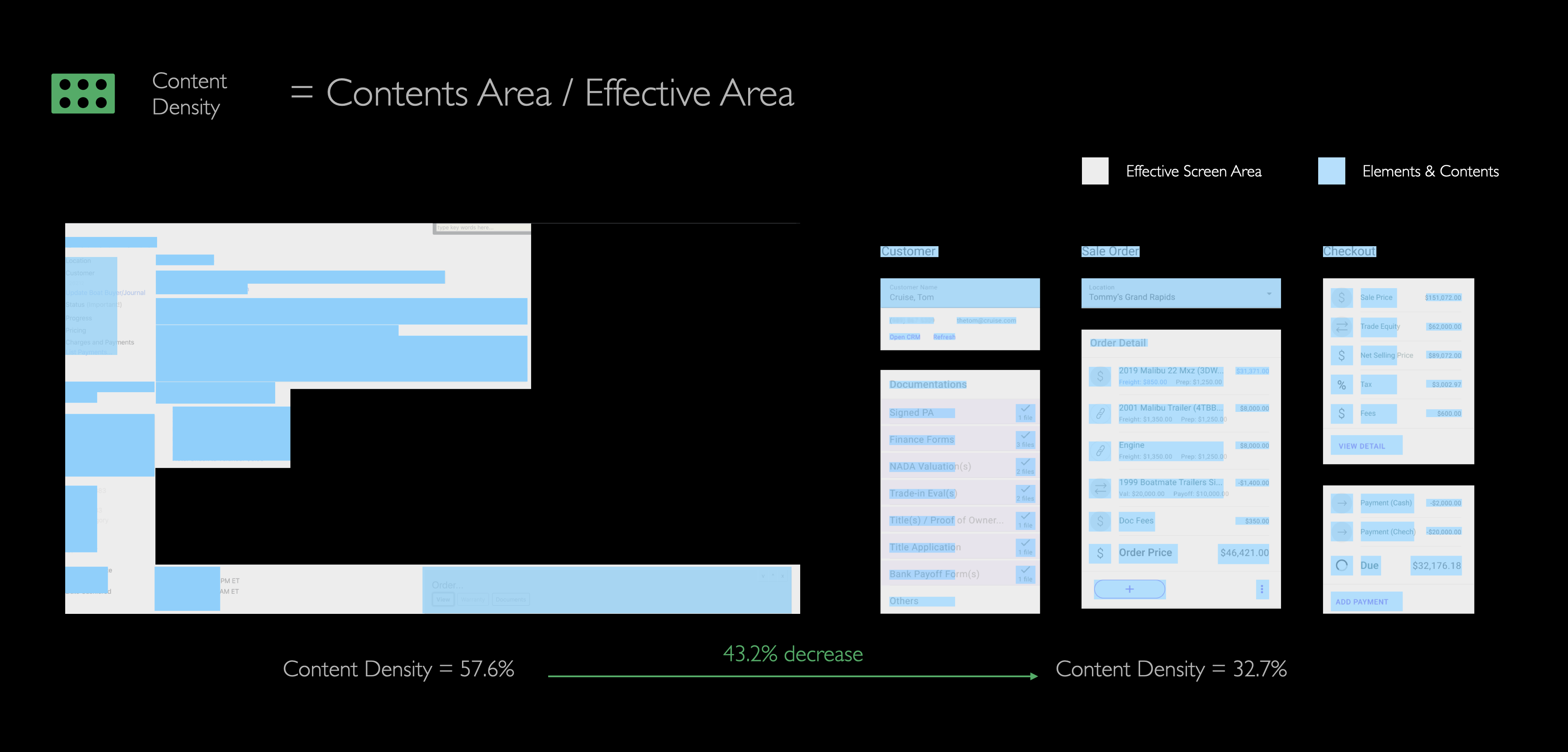
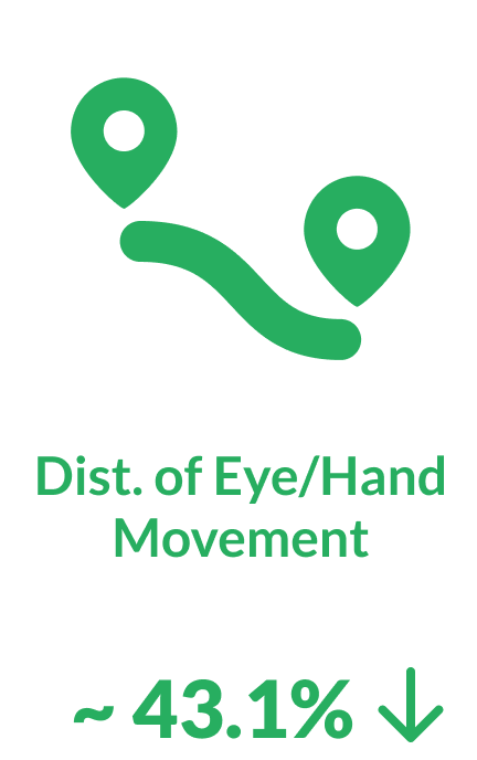
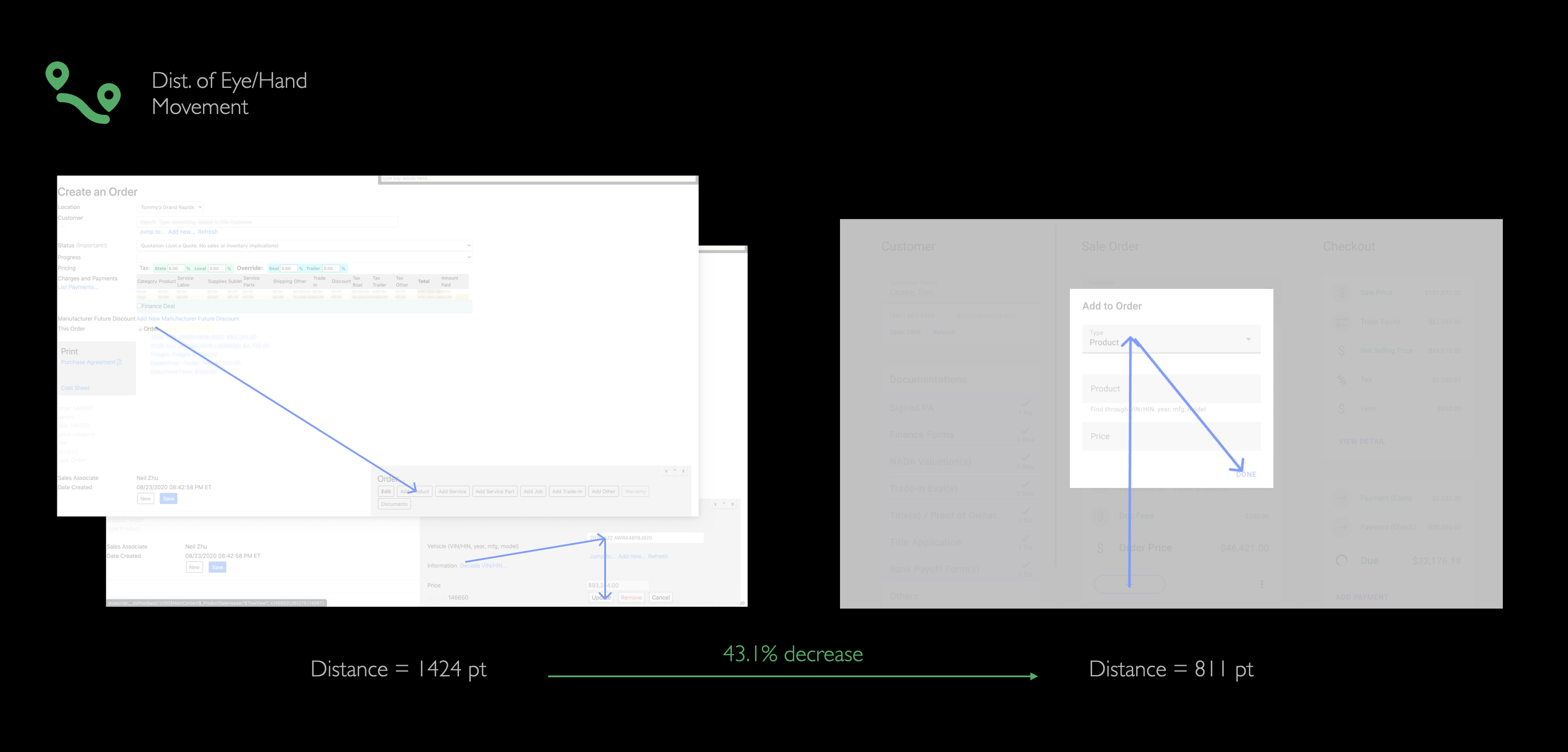
Metrics
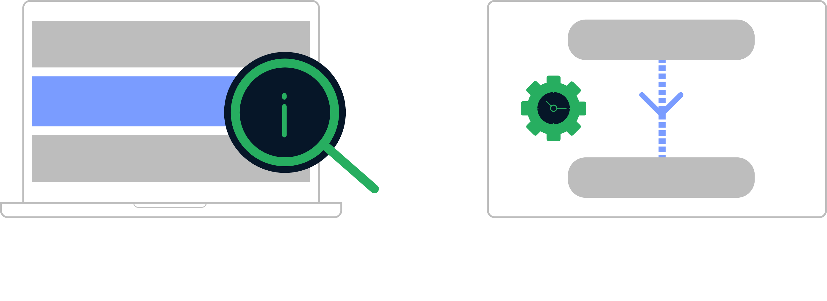
The ultimate goal of the redesign project was to create a modern experience that could boost working efficiency. Therefore, one of the most important metrics is the average time spent by salespeople to finish their jobs on the system. Because the legacy system was outdated in both UX but also performance, so we set an ambitious goal:

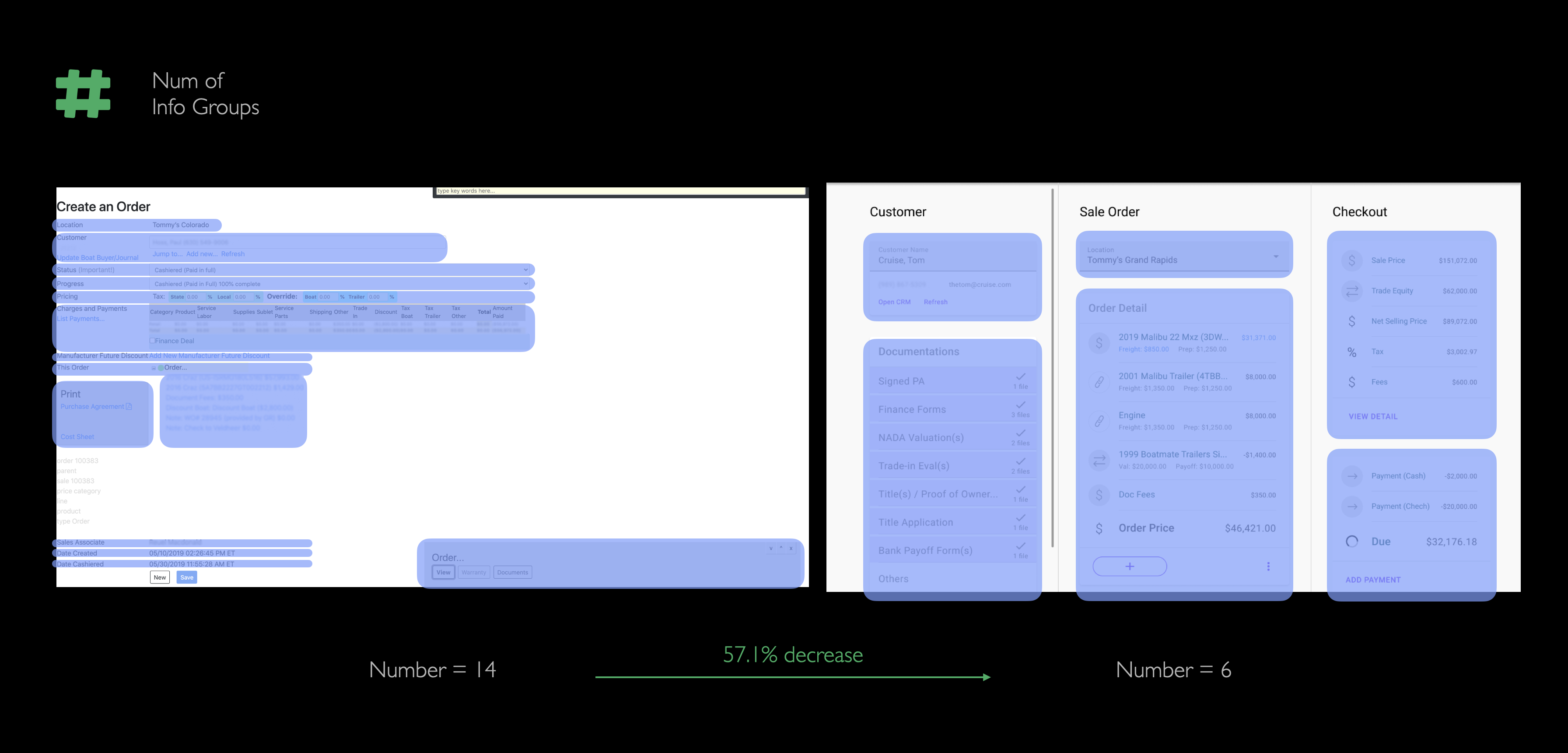
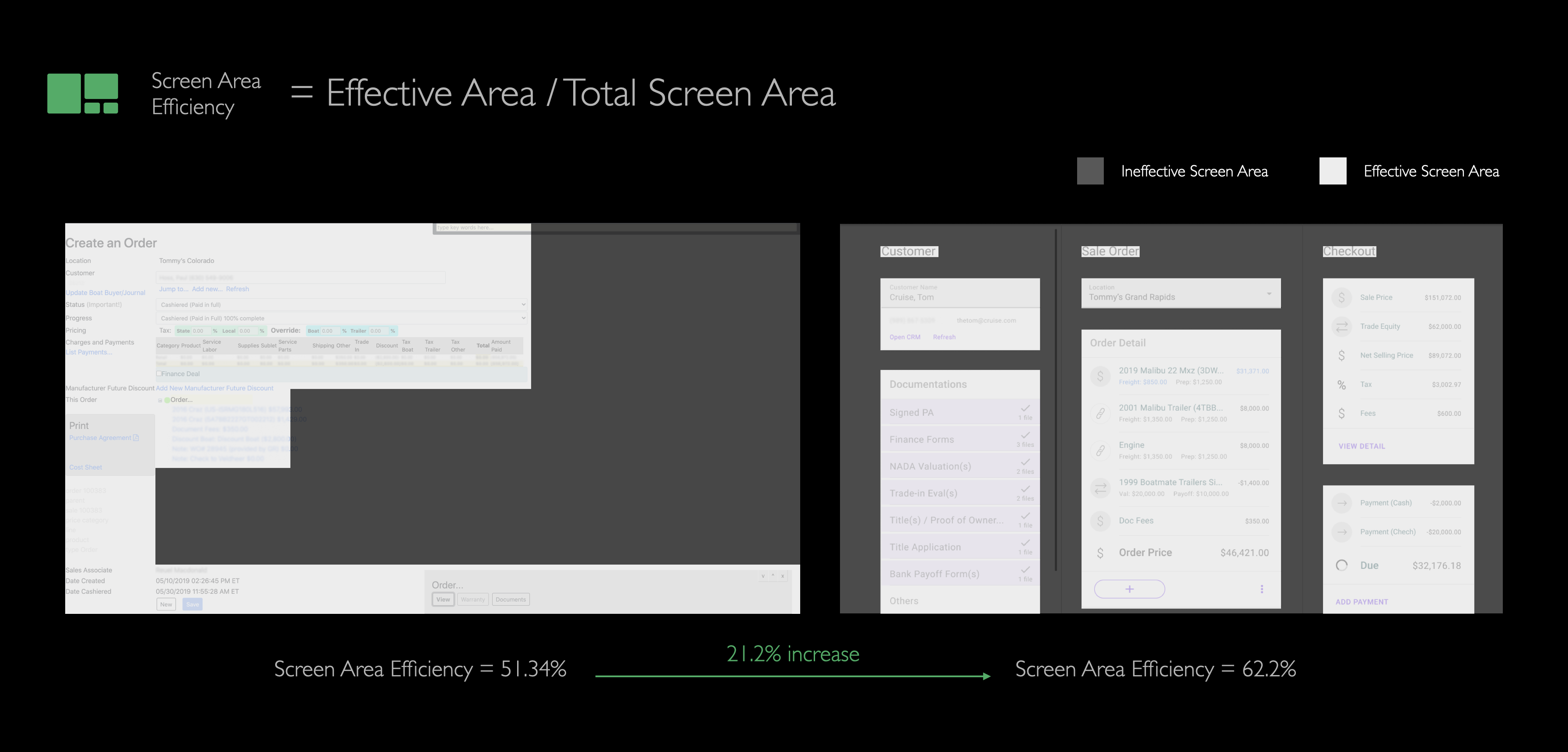
In order to achieve the goals, I proposed some specific metrics to help inform detailed design directions. To name a few:

At this moment, the product is still under development. But there was an internal demo section where we went through the same flow on both versions. The increase of the new design’s efficiency was astonishing:

Admittedly, the user who did the demo was familiar enough to both versions (although at the end of day, all salespeople will be well trained to get familiar with the web app, but it would be good if I could gather how well a novice could use the new version), and the system’s performance had been increased a lot as well. So my design work should not take the full credit of “87.5%”, therefore here are the results of some more direct design-related metrics:

Scope of My Work
To achieve the goals, my work in this project concentrated on the information structure of each major pages and the interaction
flows that facilitate users to finish their tasks.
In terms of visual design, because the engineer teams had already decided to use
Angular Material components for its overal high cost-efficiency, I started with the default MD components and made modifications if
specific needs popped up. Any further visual designs were not in the scope of MVP.

Scope of this case study
In this case study, I will present 3 specific cases, they will be related to “Information Structure” and “Interaction”, and the scopes range from a big-picture design pattern to a detailed interaction triggered by one toggle.
Design Process: 3 Sample Cases
1. PAGE ARCHITECTURE: keep the information clear & organized
PROBLEM: the contents stack on each other with few groupings
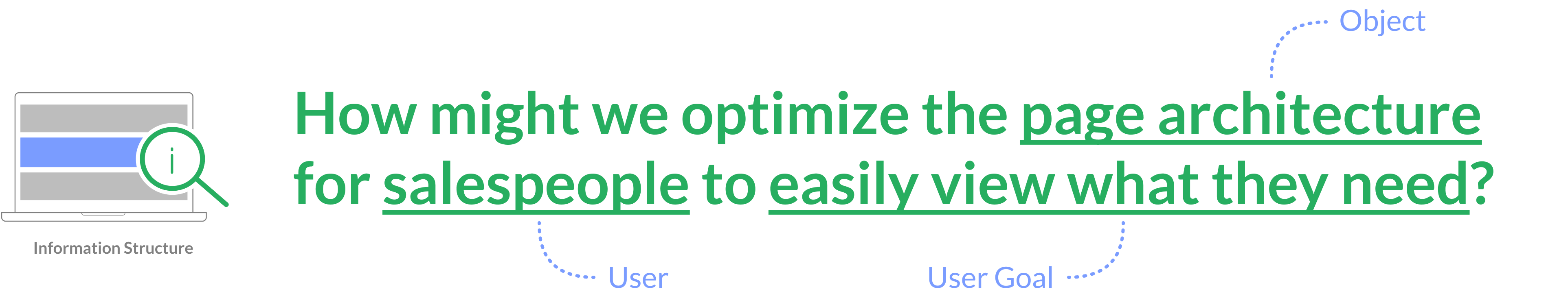
RESEARCH INSIGHT: contents can often be categorized to 3 groups
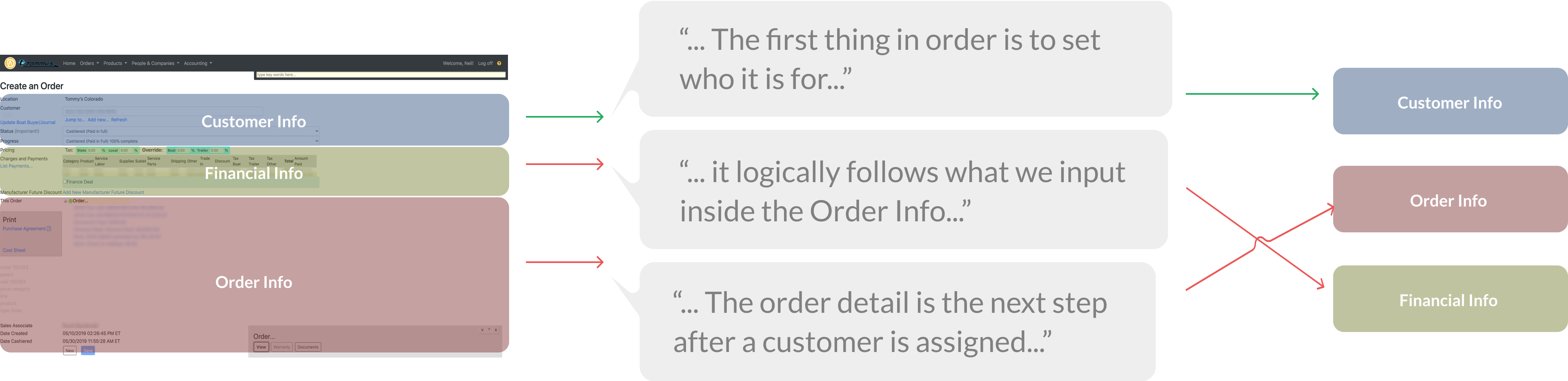
CONTENT SORTING: adjust the content groups’ sequences
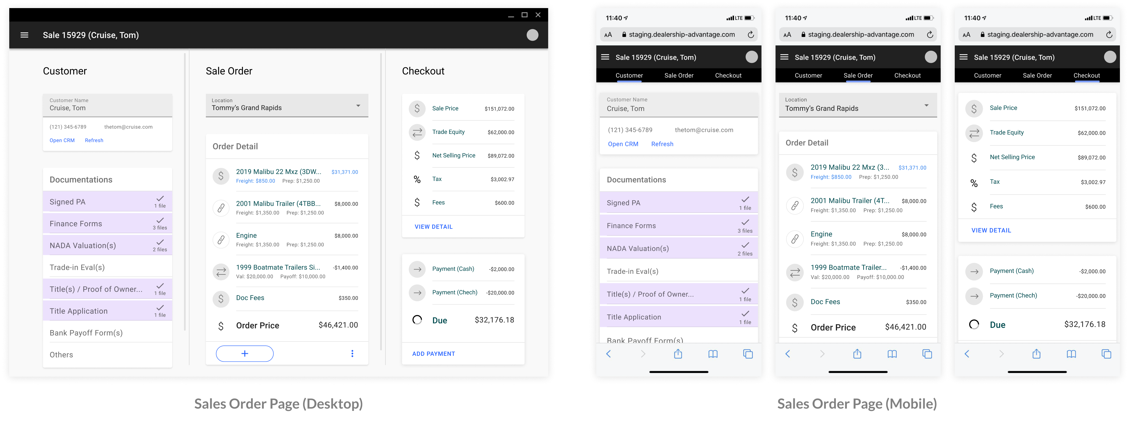
On legacy pages, the sequence of most information made sense, but it could still use some adjustments. Together with PM, we have identified a sequence that make better sense to salespeople. Below is an example of the sequence for “Sales Order Page”:
IDEATIONS: options to indicate 3 groups of information
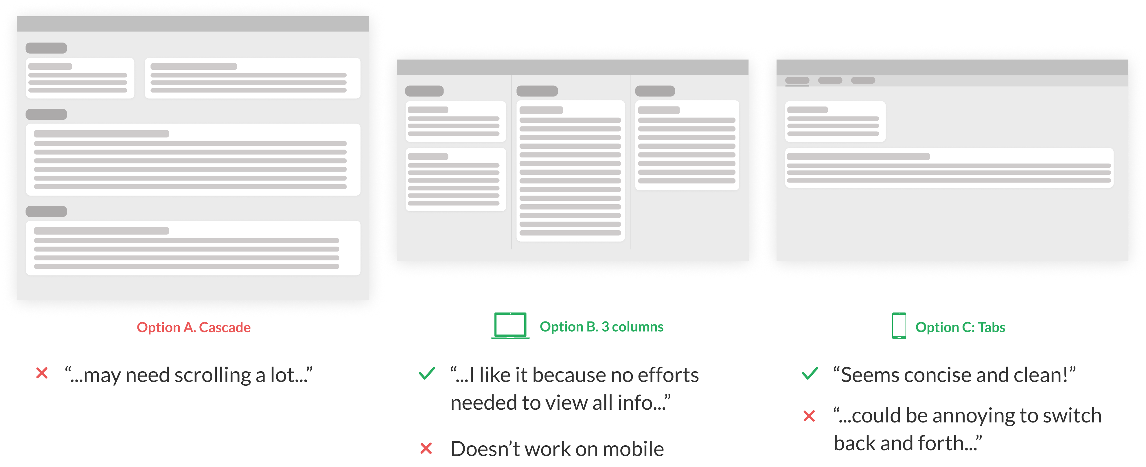
LAYOUT SAMPLE OUTCOME
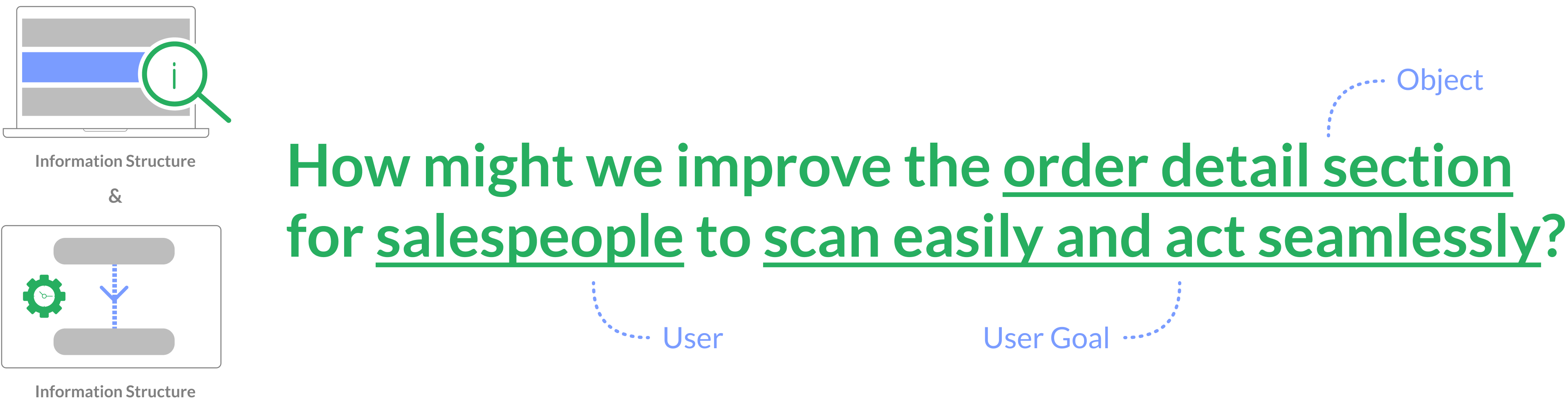
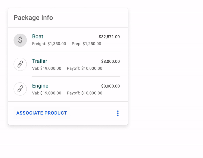
2. ORDER DETAIL SECTION: the key information in selling process
RESEARCH INSIGHT: currently, the order details are not easy to scan, and the modification flow is inconvenient
GENERAL ITERATIONS: continuous feedback loops
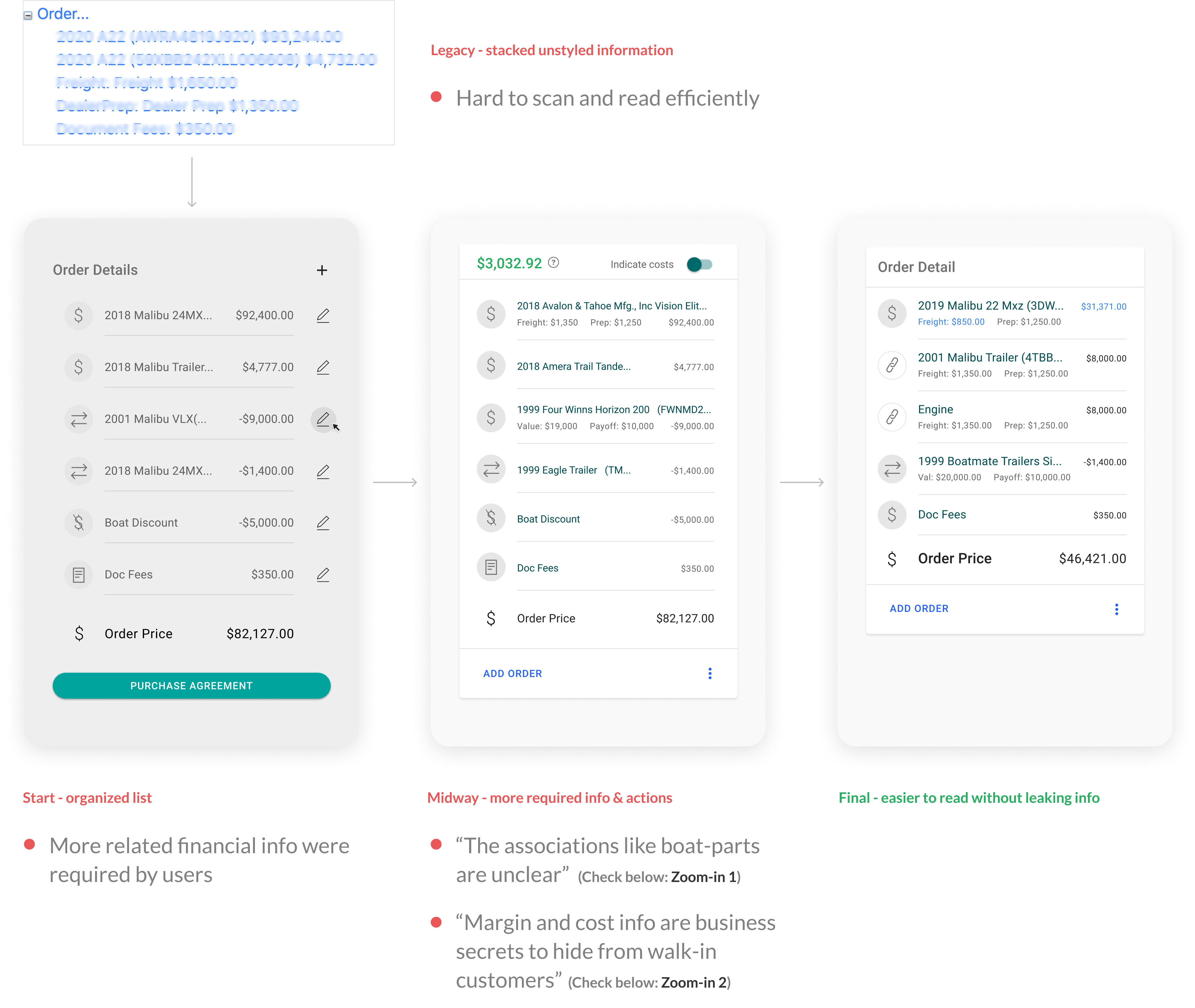
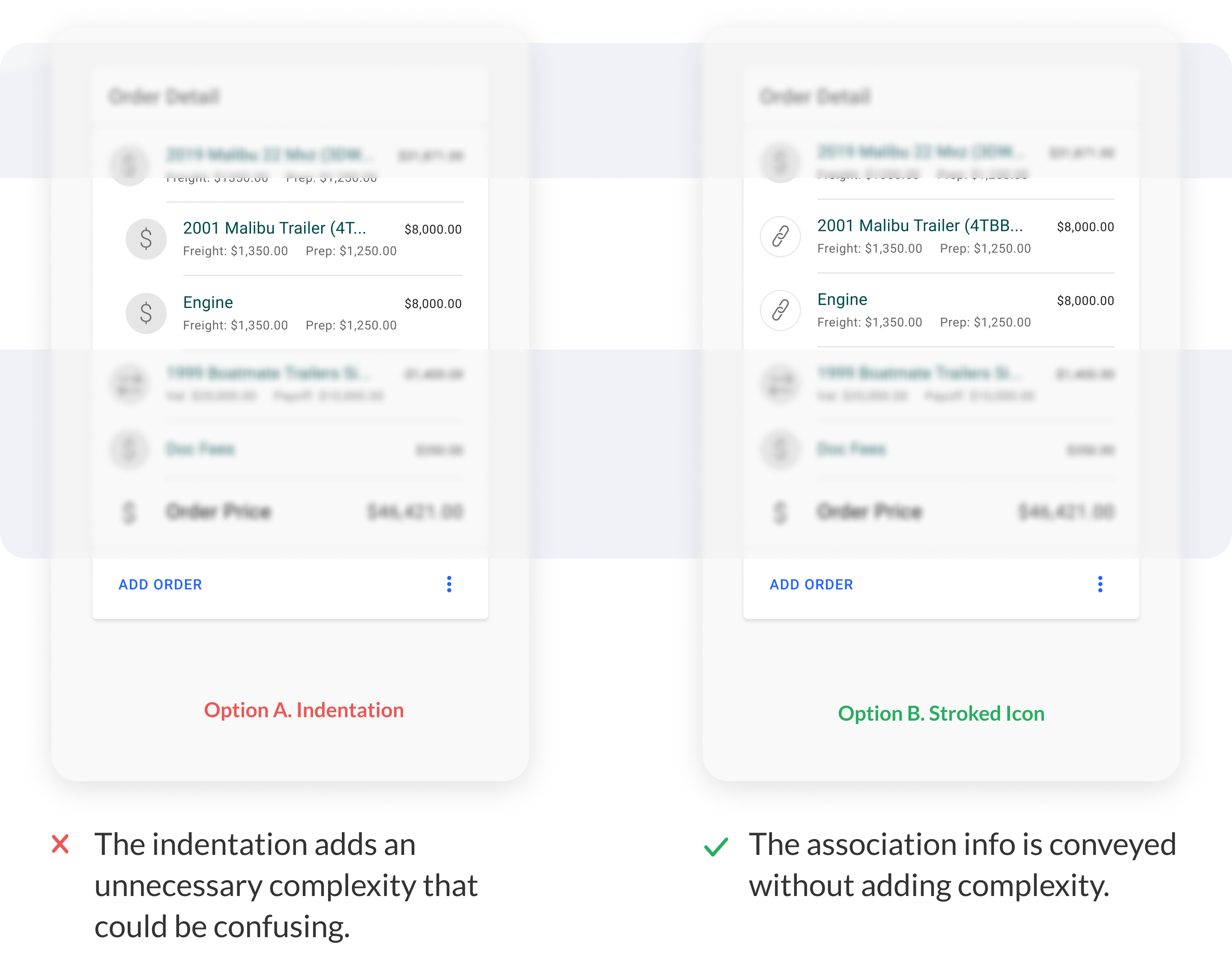
DETAIL ZOOM-IN 1: how to indicate associations?
“How might we make it clear that the trailer and engine are associated with the boat?” This was a feedback gathered from the salespeople, who wanted to easily read the boat-parts associations in order to make quick decisions when negotiating with customers face-to-face.
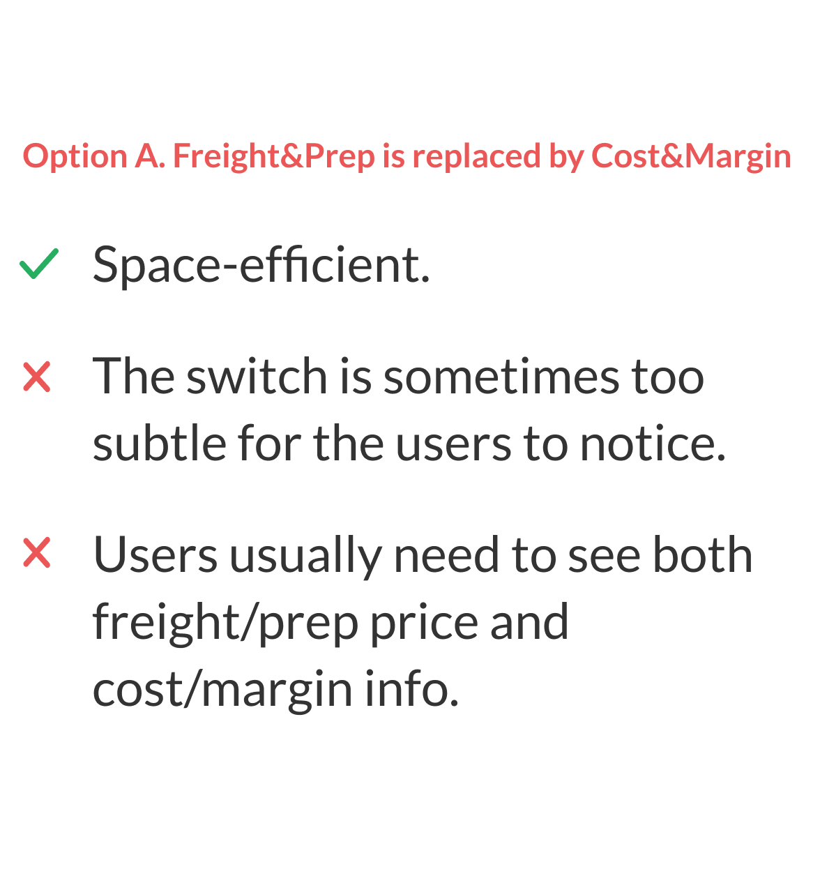
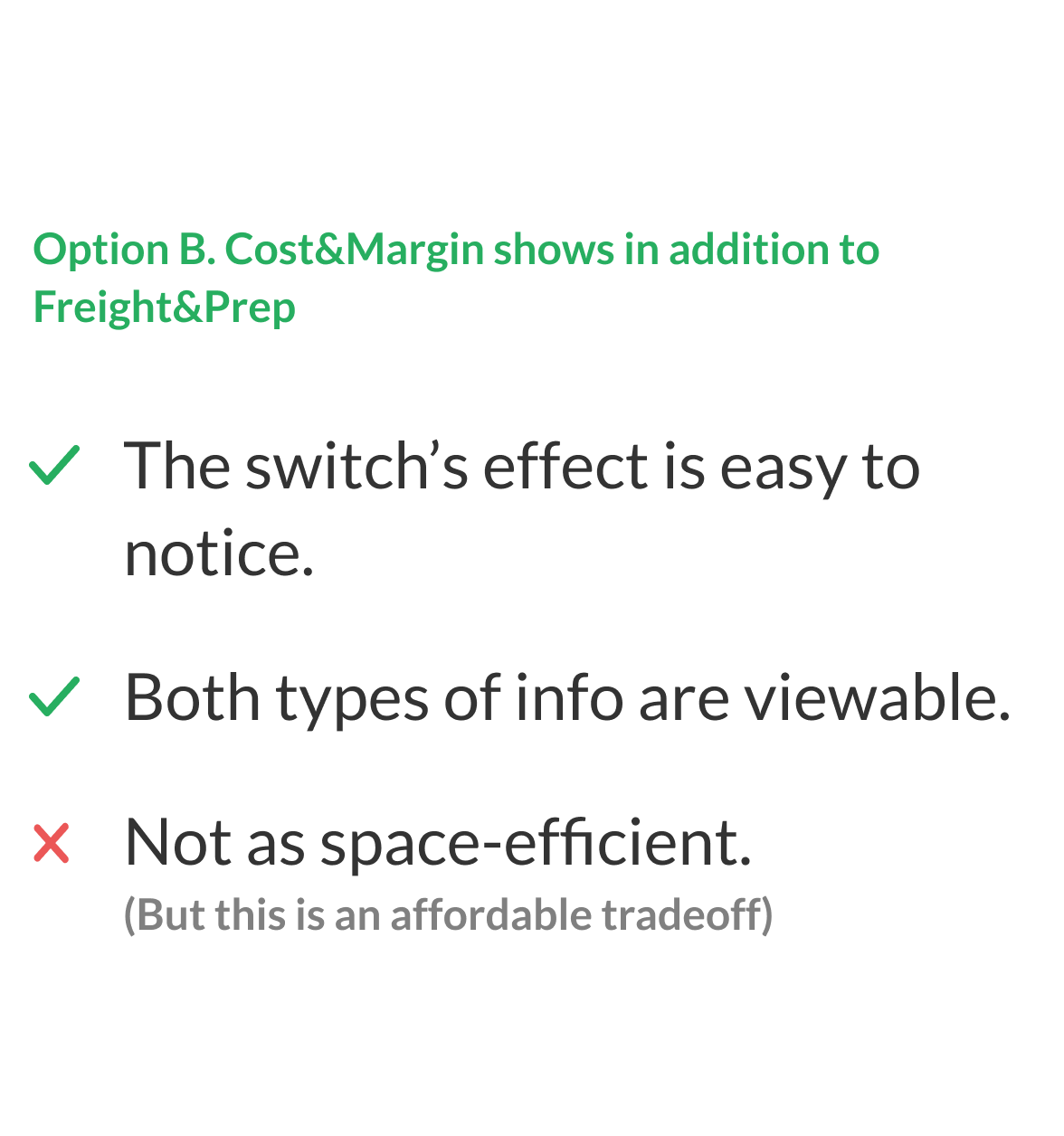
DETAIL ZOOM-IN 2: how to show/hide the cost & margin Info?
“Margin and cost info are business secrets that need to be hidden from walk-in customers”, said by the Sales expert.
In other words, “Bob” does not want “Mark” to know how much the cost and current margin a r when they look at the same screen in store
preparing for the order.
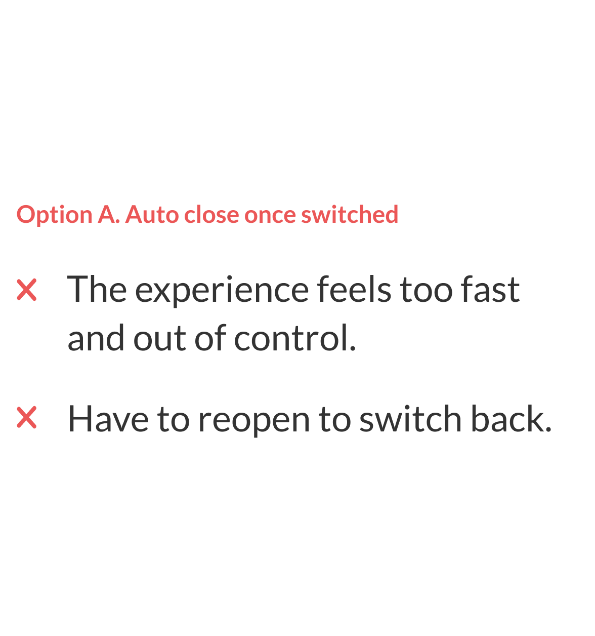
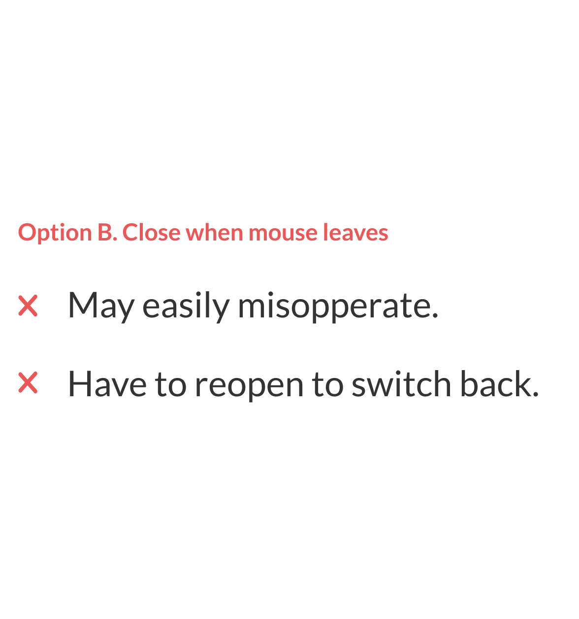
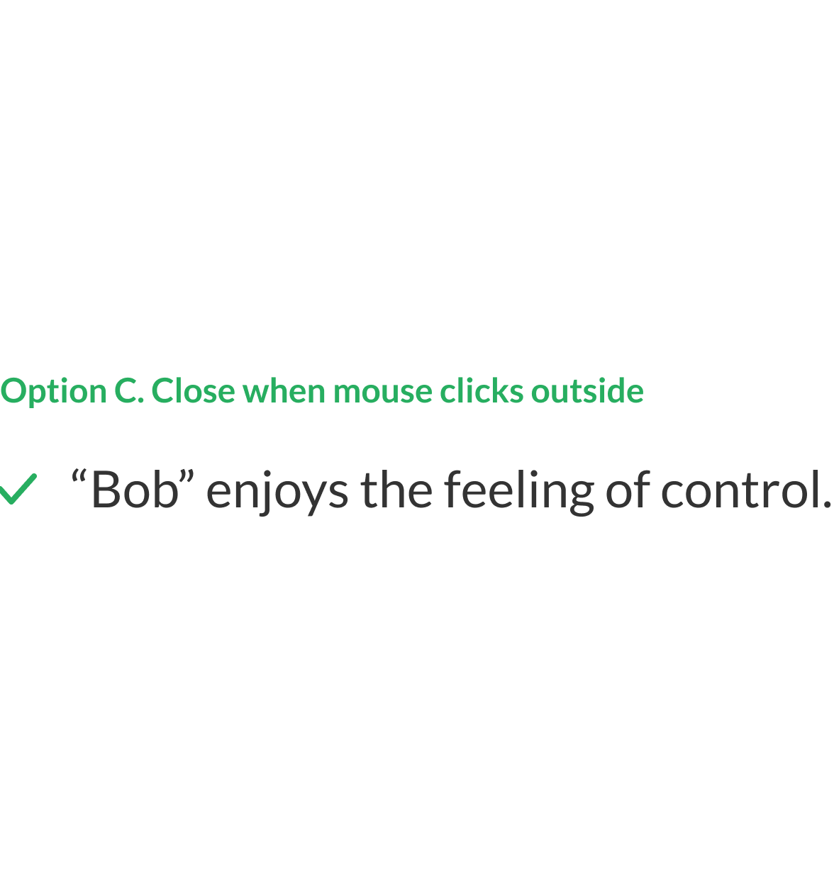
1. When the cost & margin are hidden or unhidden, what’s different?

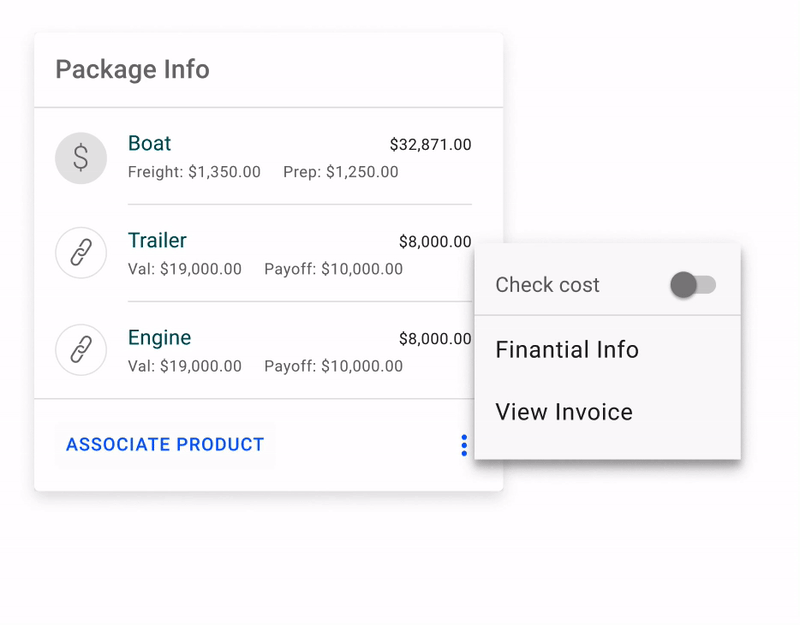
2. What happens to the menu after clicking the toggle/switch?


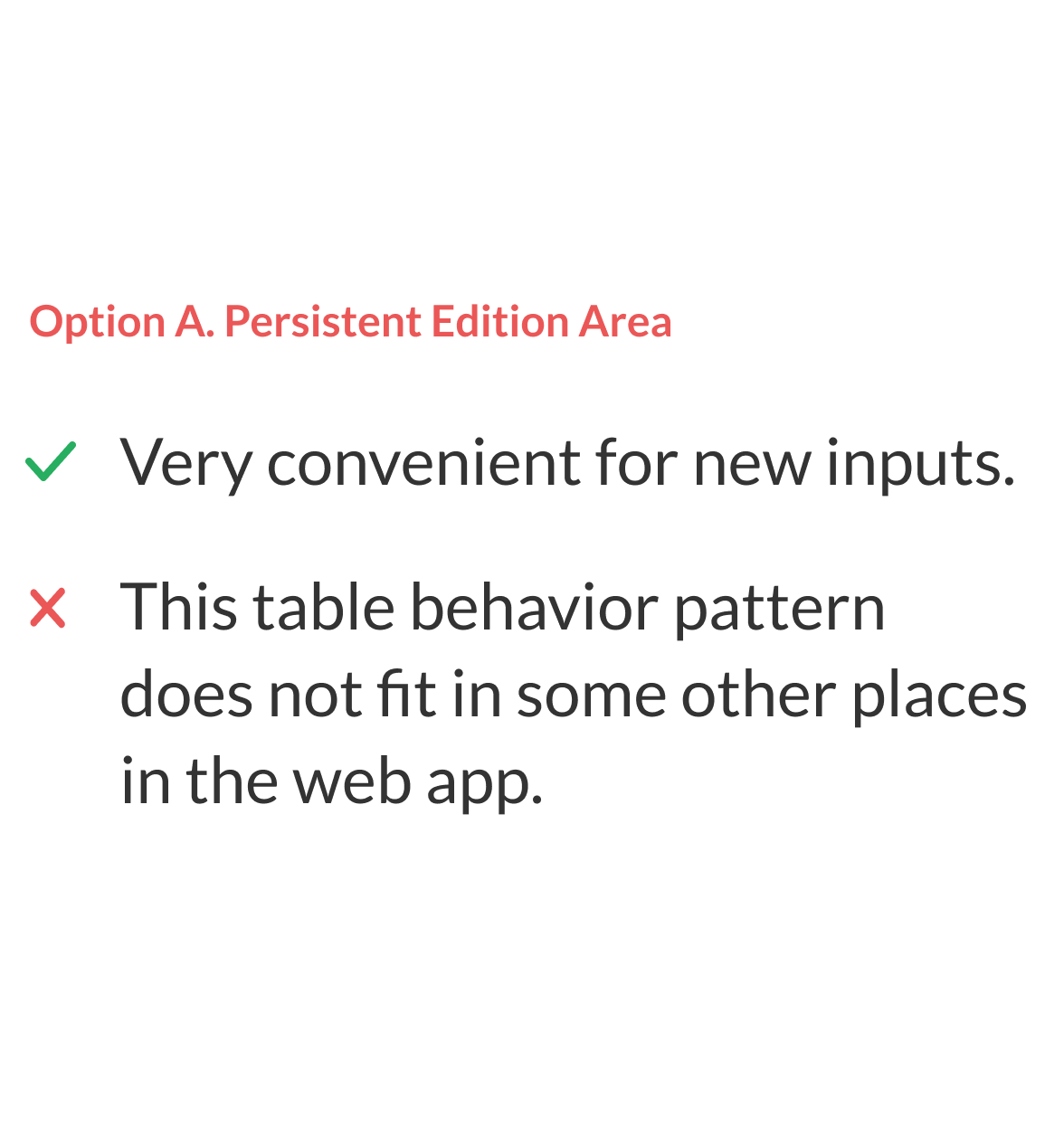
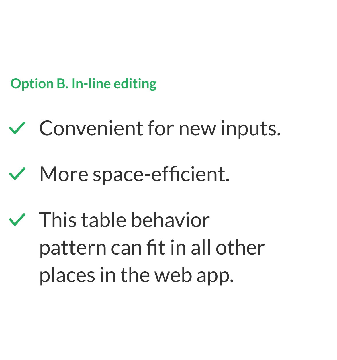
3. CUSTOMER JOURNAL INPUT: manage customers’ info seamlessly
RESEARCH INSIGHT: currently, journal-update flow for customers is not clean and efficient enough
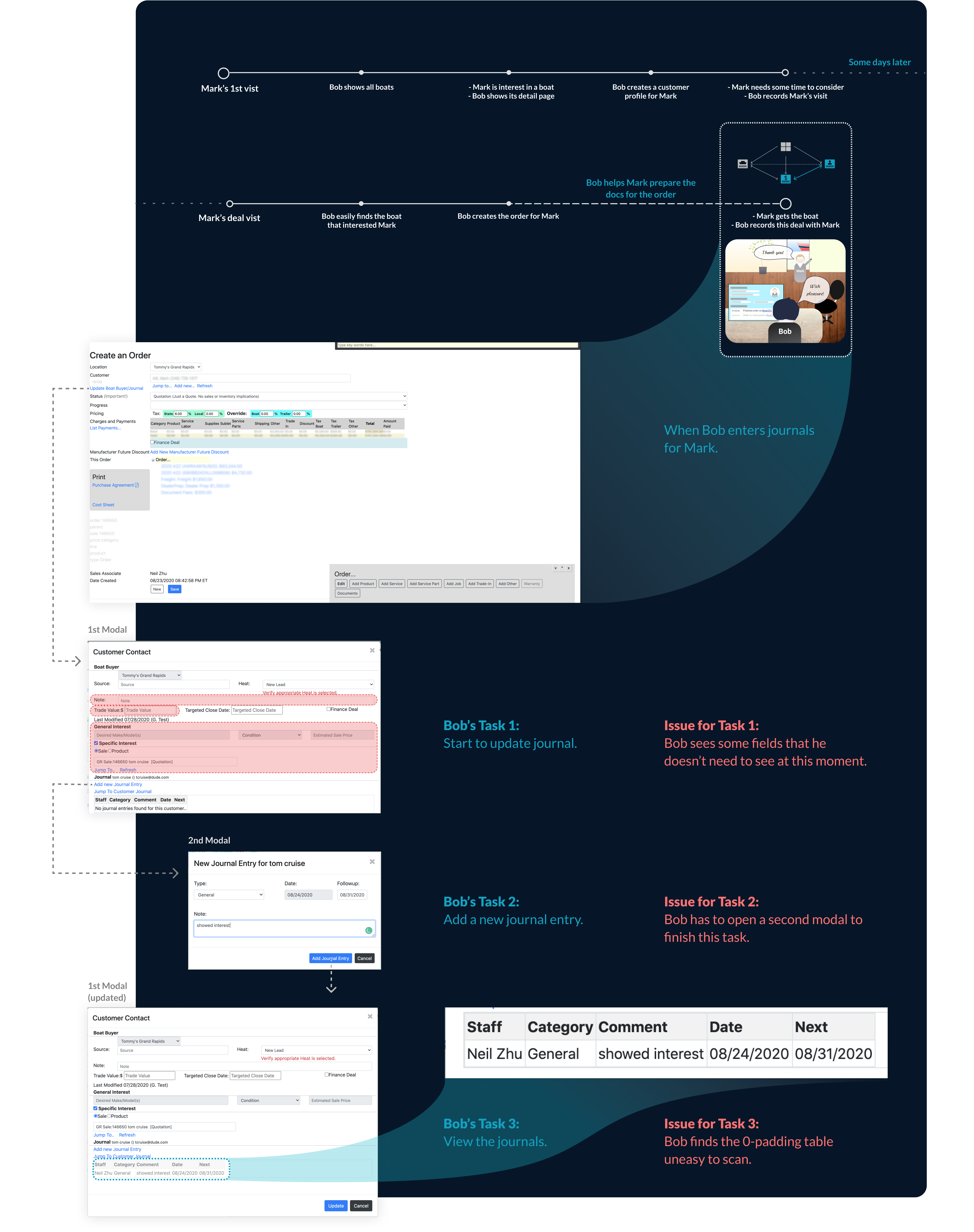
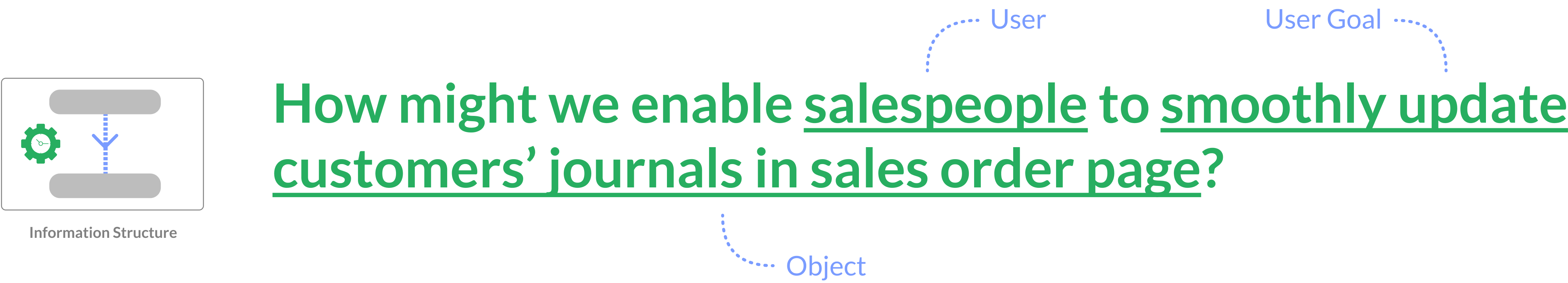
IDEATION: what’s the simplest journal-updating flow and UI?
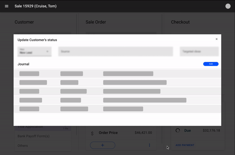
Originally, the user needed to open 2 models to finish the work (Issue for Task 2):
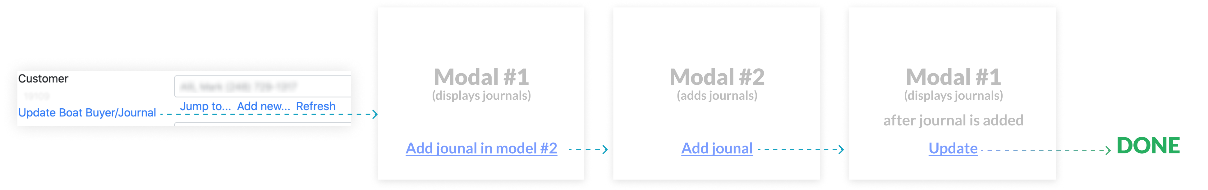
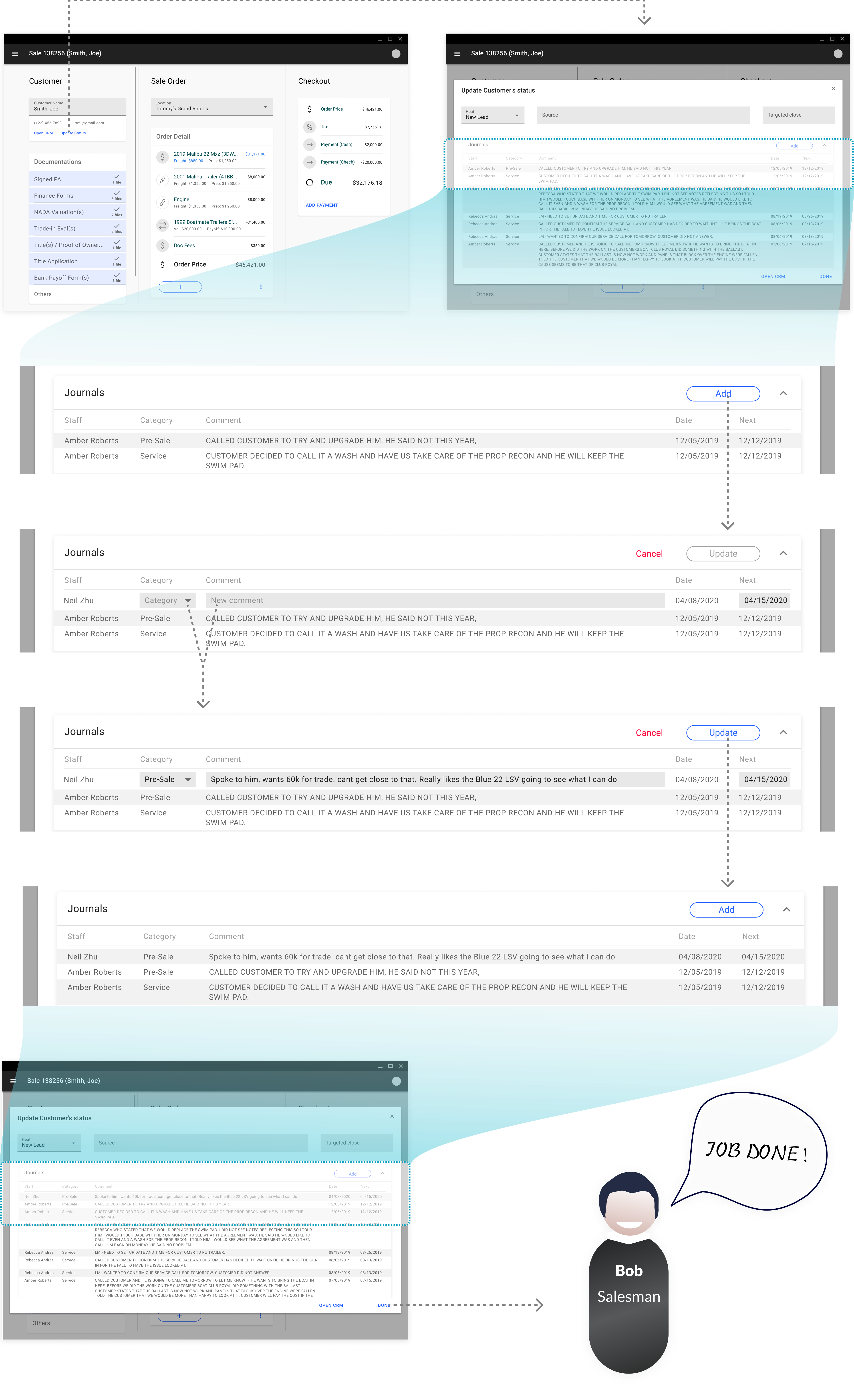
As aforementioned, there are some redundant fields on the Model #1 (Issue for Task 1). By cleaning it, we had the opportunity to have only one model in the flow:

Then the question simply became how might we display the journals and make them updatable in only one model?
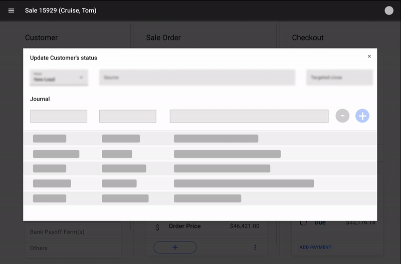
OUTCOME: interaction flow that shows the efficiency in both UI and flow

The Outcomes & Impacts
Outcomes
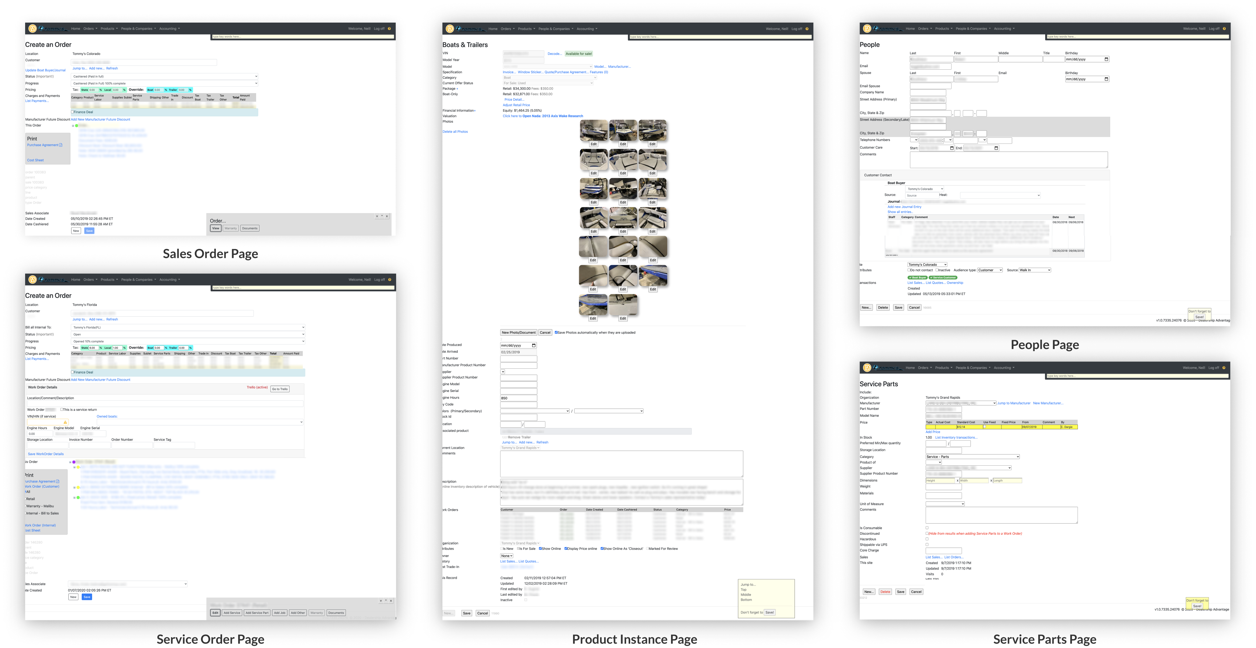
After months of iterations, the web app has been improved in terms of look and feel as well as interaction experience. Taking one major page from each module as examples, you can see how the new version is compared to before:
Impacts
As aforementioned, the redesigned system’s efficiency has been greatly increased:

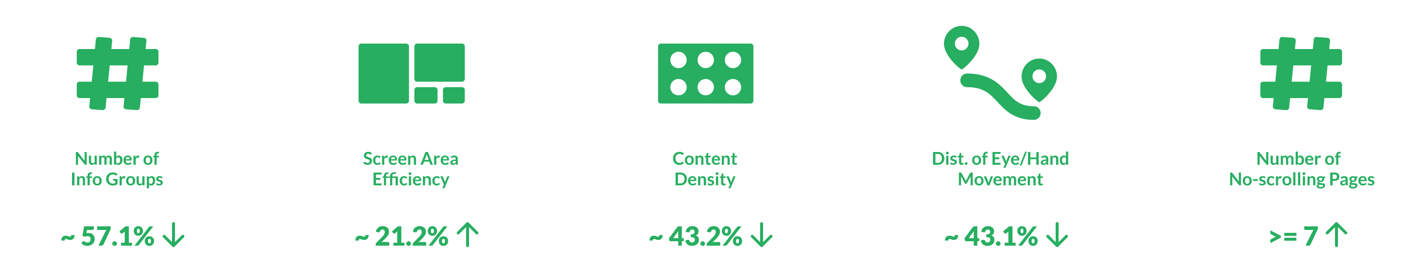
Among all the factors contributed to this big improvement, my redesign work takes credits for at least the following objective metrics (Took "Sales Order Page" as the example for calculations for all metrics except "Number of No-scrolling Pages"):