Keebridge
Keebridge keeps living environment comfortable,by bridging the residents and leasing office.

Type
Mobile App resulted from a course named Intro to Interaction Design
Time
2017.9-2017.12
Skills
Storyboard / Wireframe / Low-fi Prototype / Hi-fi Prototype
Tools
Realtimeboard / Sketch / Invision
PROBLEM & GOAL
Near university campuses, there are many communities that lease apartments to university-related people like students.
For students living in such communities, the connection between them and the leasing offices matters,
especially for public amenity and indoor maintenance.
However, the connection may not be smooth and efficient occasionally:
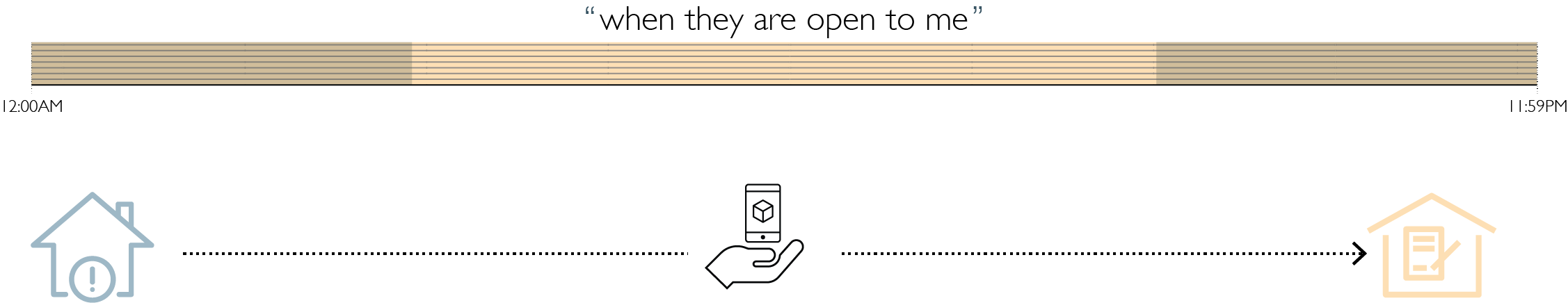
To optimize and smoothen the connection, the goal of "Keebridge" is:
RESEARCH
Competitor Analysis

Observation
-
Software or Apps obviously have more features to help residents and apartments administrators to deal with issues conveniently.
-
Among all the features listed, three categories stand out: helping organizing information for administrators, shortcuts for raising issues, and facilitating neighborhood relationship.
Opportunity
-
A method of "providng shortcuts to solve issues" is still yet to exist.
-
All methods need certain amounts of person-to-person communications, which may sometimes reduce efficiency
Interview
Next, I started to talk with different stakeholders in the communication process. They are residents, leassing office staff and maintenance staff. Based on our conversations, I got following valuable insights for each type:
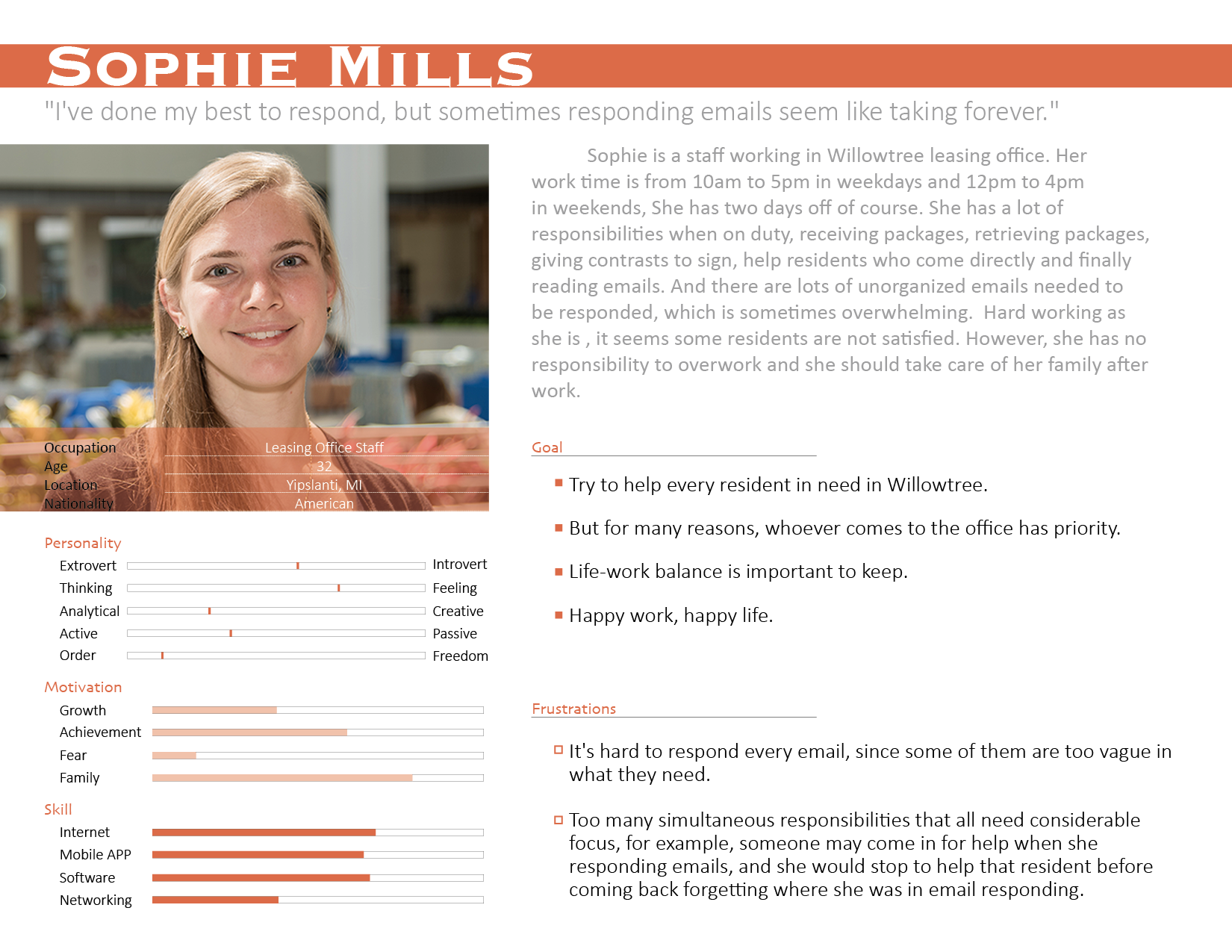
Residents
-
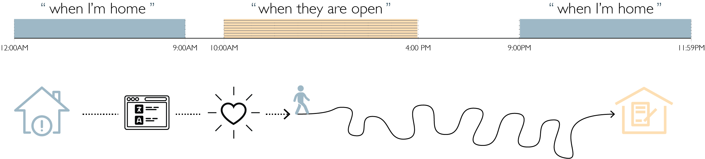
Schedules “always do not overlap with the office's open time”;
-
Language can sometimes be an issue for foreign students/scholars in communicating “daily-life issues” with the staff.
-
Some residents would like to learn some basic skills to “handle simple issues” themselves.
Office Staff
-
Current way of dealing with requests from residents is “easy to be overwhelming”;
-
“Need a lot of efforts to keep everything organized”.
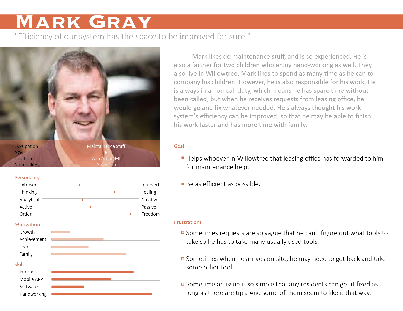
Maintenance Staff
-
some issues can be solved by residents themselves as long as they can get some tips.
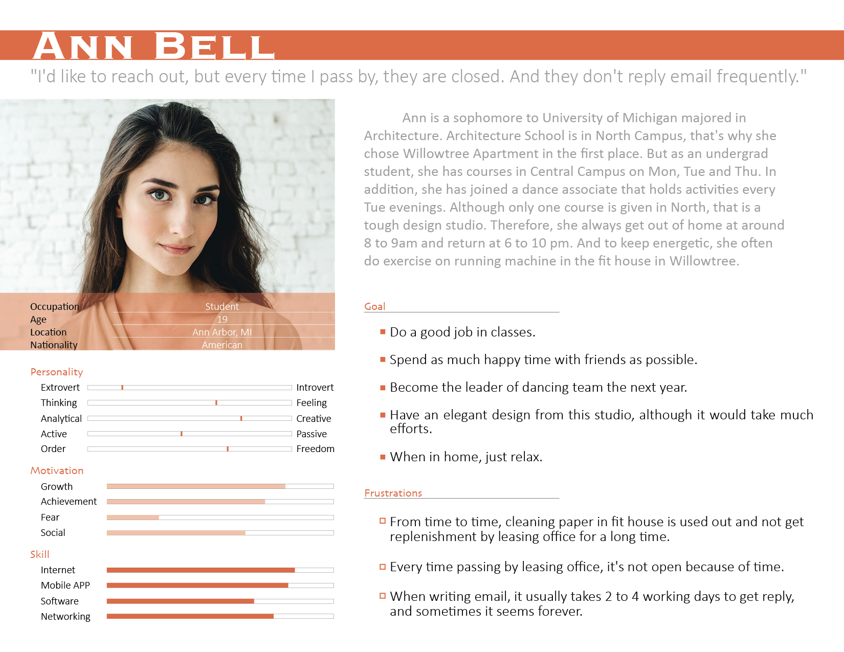
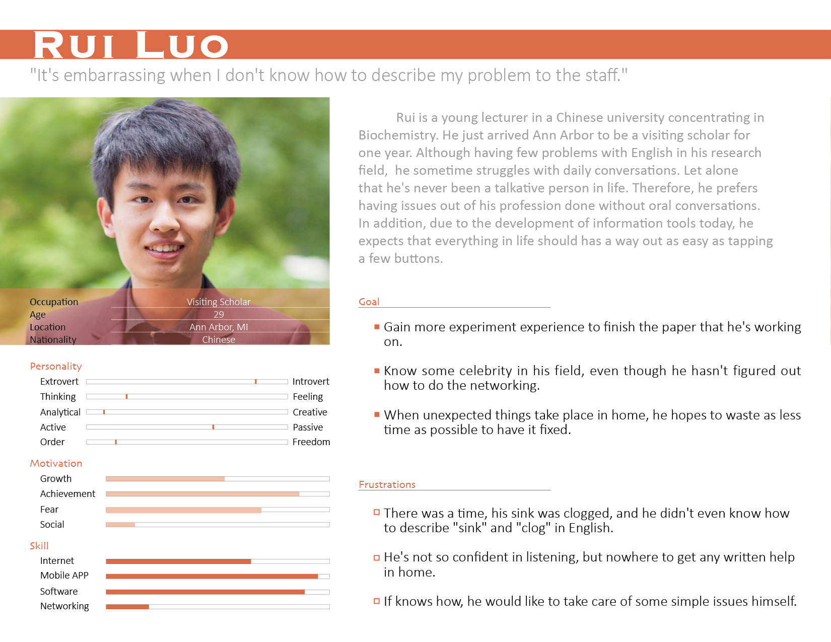
Persona
To summarize the findings and build sympathy for users, 4 personas were created for each major typical users:
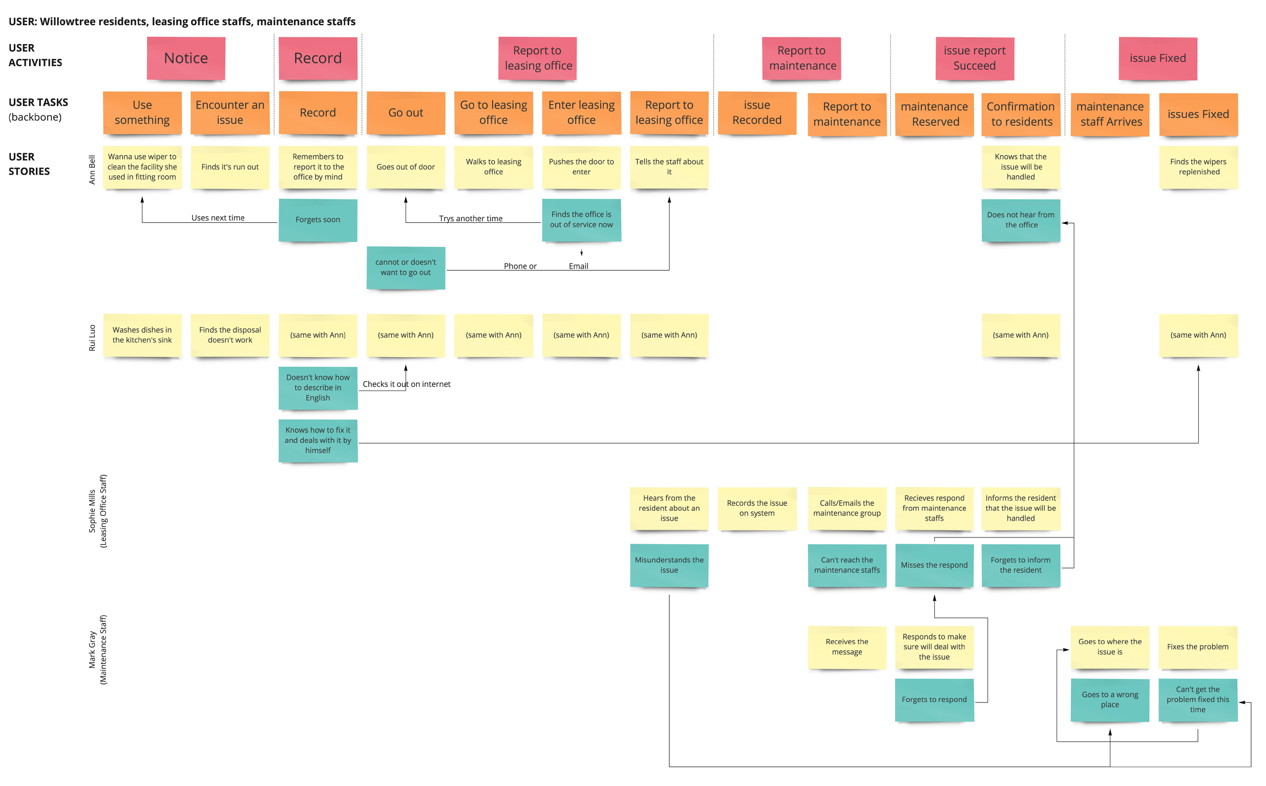
User Journey
IDEATION
Brainstorm
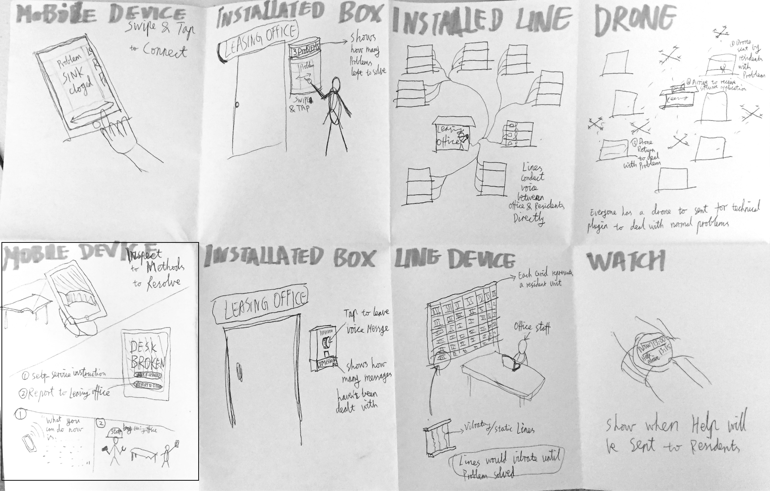
In order to explore the possibilities and potentials, I brainstormed and sketched the folowing 8 ideas.
Storyboards
Then I talked with 3 potential users about the ideas, and based on their feedback, I modified some of the ideas and developed them into a set of storyboards.
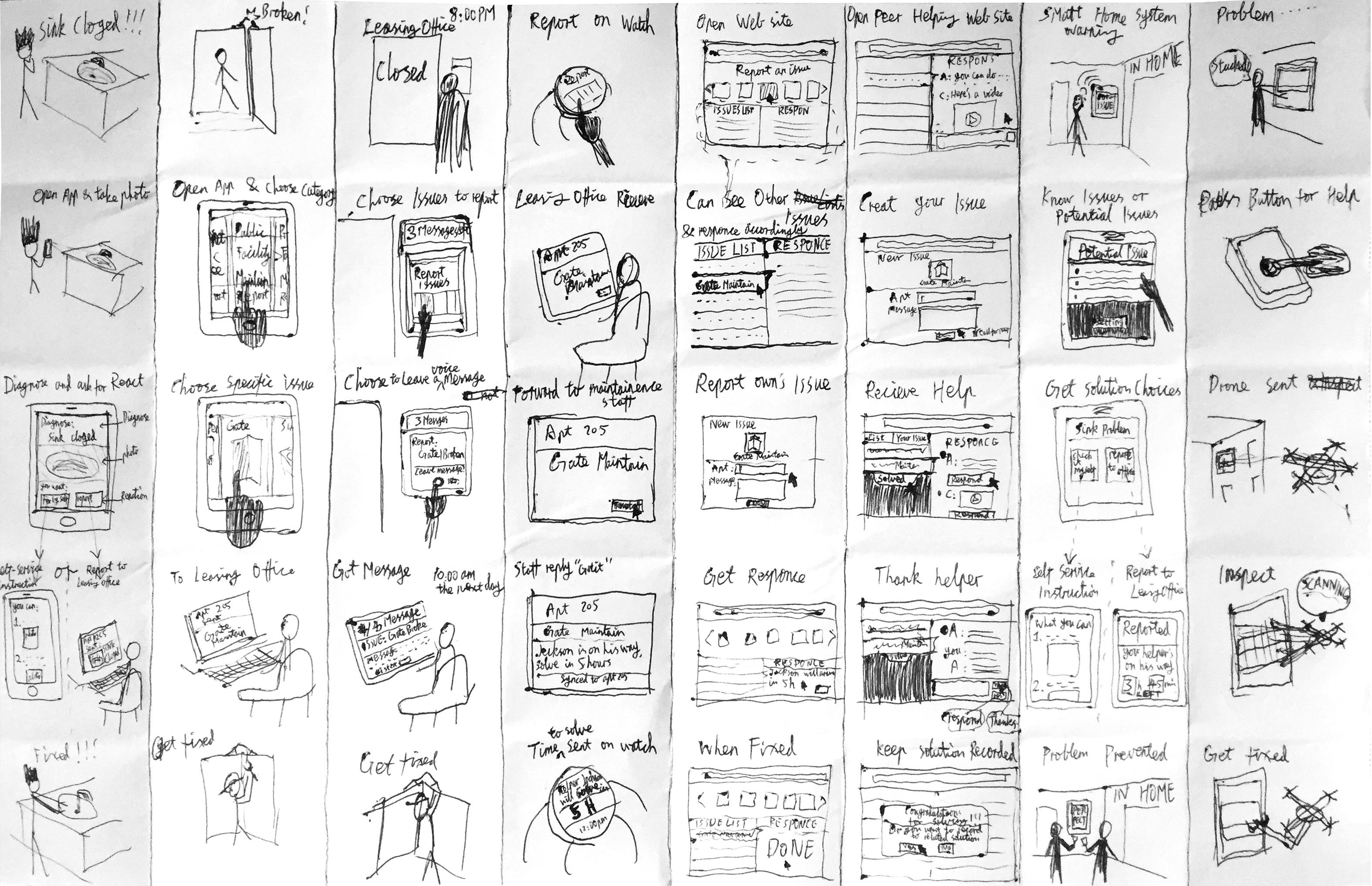
After checking back with the 3 target users, I selected the most welcomed and potentially practical solution to start with, while keeping some of others for further potential development.
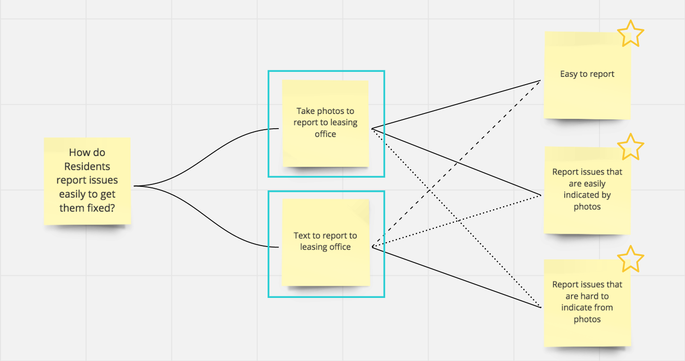
Design Rationale _ Questions - Options - Criteria (QOC)
At this moment, there were three design decisions needed to be made to design interactions for the core functionality (requesting help): the type of platform to start with; the process of requesting help; and the process of rescheduling if the time doesn't work well.


Wireframes

-
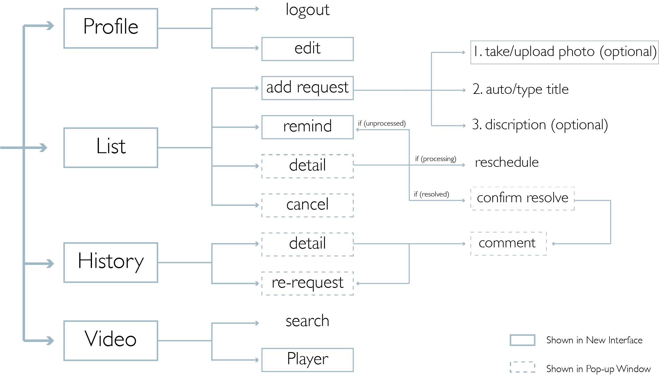
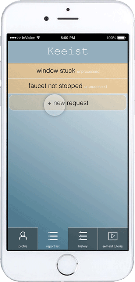
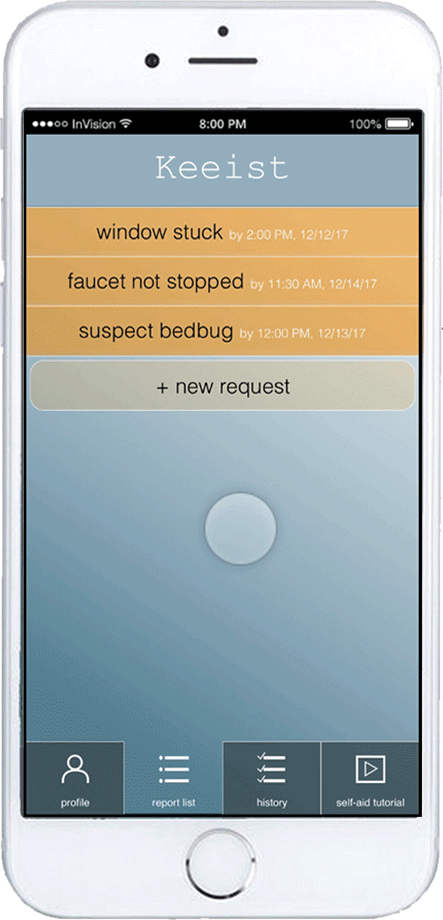
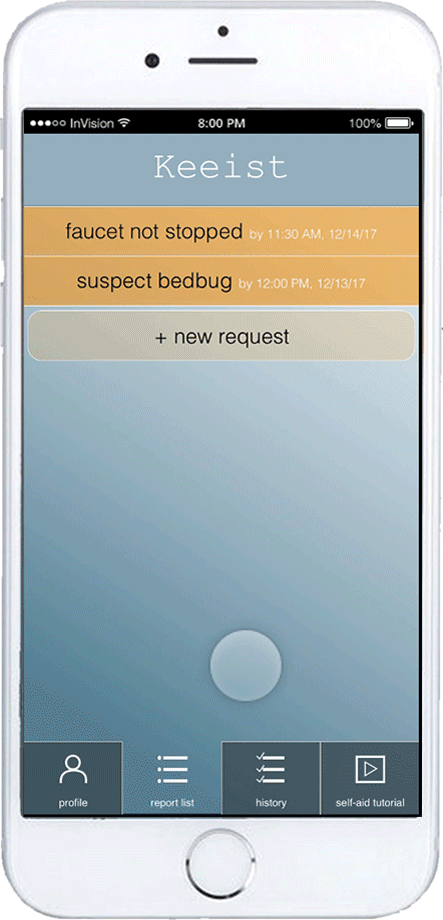
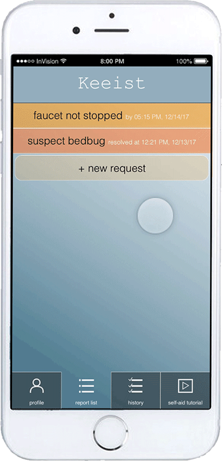
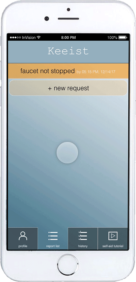
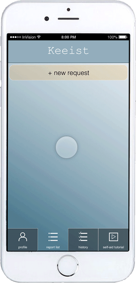
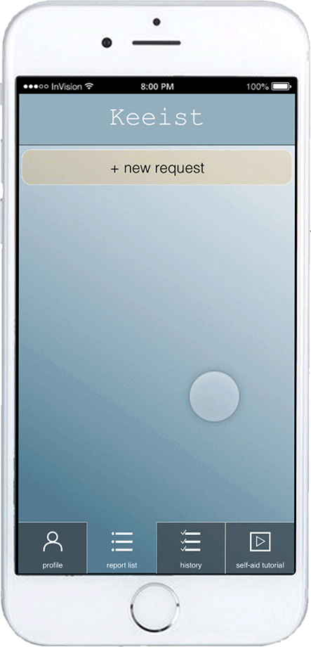
Reported List ---- List all requests the user sent to leasing office and their status.
-
Take Photo ---- When creating request, the user can take a picture of that issue.
-
Text ---- When creating request, the user can write to discribe the issue.
-
Template List ---- If the same issue reappears after fixed, users can re-report them.
-
Current Status_ Pending ---- Detail page of the request when no staff is assigned to fix it.
-
Current Status_ Processing ---- Detail page of the request when a staff is sent to help.
Sketch of Workflow

LO-FI PROTOTYPE
Based on the wireframes, I developed the paper prototype and did usability tests with two target users on it. Below is a demo of the prototype.
for Next Iteration
-
Status of each request needs to be indicated on the list.
-
New Report button needs to be differentiated from other items on the list.
-
During the adding-report process, the first interface as taking photo is confusing sometimes since it's an optional input.
-
There's a need for profile setting in case any basic information like apt address changes.
-
Since the main function of request list is almost here, a tutorial function mentioned by 2 personas can try to be implemented.
-
The single radio button at the bottom of the interface is a little strange. There can to be a nav bar instead, since I'll have more functions.
SITEMAP
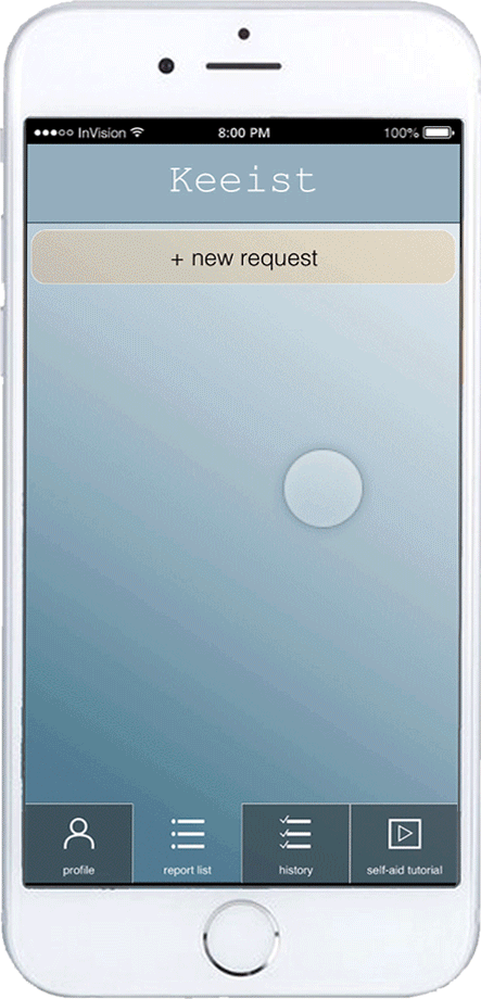
FINAL DESIGN
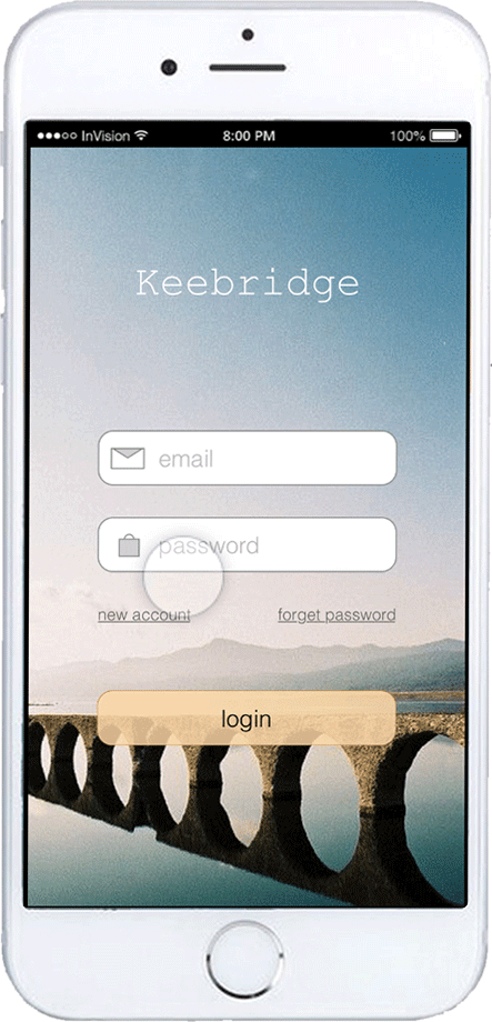
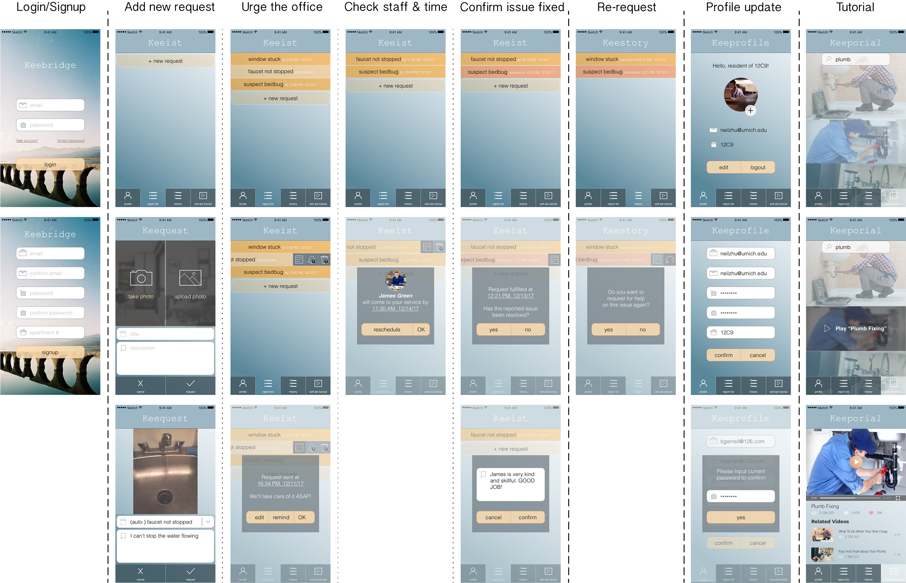
Login/Signup
New Request_ Photo
New Request_ Photo
New Request_ Album

New Request_ Text
New Request_ Text
List_ Cancel Request
List_ Reschedule
List_ Reschedule
List_ Confirm Fixed & Comment
History_ Re-request
History_ Re-request
Profile
Tutorial
Tutorial
FUTURE ITERATION
After building the prototype, I have tested it with 2 users, and got some very valuable feedback for further iterations when possible.
-
Since the number of issues may not be so high, using a narrow rectangle to represent the requests may not not be efficient in using the screen space. I plan to represent each request item in a chunk-ish form to make a better use of the interface and to convey more important information on the list.
-
Currently, the color palette needs to be optimized since there're some confusions like, red colors represents "fixed" here are used to represent "error" in many other cases.
-
It is desired to see a waitlist about how many people's waiting in fromt of the user.
-
In detail, there are some places confusing to users. E.g. When adding new request, image input and description should be noted "optional".
TAKEAWAY
-
User Test matters. It is very important to keep mind open when doing design, since I don't design for myself. Either peers or users, "others" see things I miss from time to time, and I have got a lot of valuable feedback from them during the process.
-
Critical feedback are important and are always helpful. At first, it was easy to feel frustrated about having some negative feedback. But through the process of rounds of design-test-iteration, I have learned that those are quite indispensable and fundamental for improving a project to a higher level.
-
Iterations make a design better and better. Although I have known it from my architecture experience, I have seen iterations more and more important during the process of design. Combined with feedback, iterations may always improve a design.